W hat exactly is a good livery? Once a year our
Page 34
Page 35
Page 36
Page 37
Page 38
Page 39
If you've noticed an error in this article please click here to report it so we can fix it.
panel of judges in the Commercial Motor ICI Autocolor Livery Competition seek to answer that question when they plough through hundreds of transparencies from hopeful operators, big and small, throughout the country.
In a nutshell a good livery, be it on a truck, van or bus, must be consistent, striking and memorable. But it must do more than just impart information. It has to say something about your company: its aims in business, its professional philosophy; what it does . . . and how well it does it. And it's got to do all that in the time it takes to see a truck go by on the motorway.
If your livery can do all those things then you're well on the way to getting a vital business message over. Equally important, you'll be helping to raise the image of the road transport industry along the way.
So after 20 years of CM Livery Awards, have liveries improved? According to one of our judges: `The worst are still pretty awful. . . but the good ones are getting better." As usual the awards were based on different CV weight categories and a PSV class. This year, however, we've expanded the competition by including a prize for Best New Corporate Image, for companies which have launched a new corporate design on their vehicles during the past 18 months.
The response was certainly impressive, and in early August our judging panel sat down to work looking at over 600 slides From close to 200 companies. After first knocking out the also-rans it was a case of going back to the shortlisted contenders and thrashing out a one, two, three with commendations awarded to other deserving operators.
Our judges are deliberately chosen to include representatives from the design world, rather than just the road transport industry — for the first time we were joined by Peter Green, the assistant editor of Options magazine.
Among this year's entrants were familiar faces from previous years. With some contestants entering vehicles featuring the same livery, but in more than one weight category, it was apparent that what worked well on an artic combination didn't automatically score highly on a panel van, and vice versa.
CLASS ONE
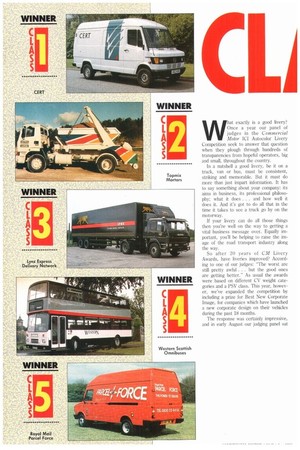
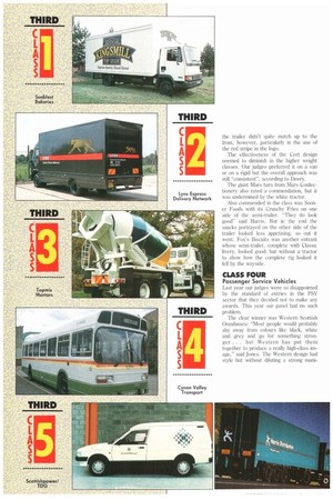
Up to 7.5 tonnes GVW Cert's striking design was enough to give it the top spot. The judges liked its cohesive approach, the use of colours and the well-executed tick logo. "Very nice, very clean" was Peter Green's verdict. For John Harris it showed "a tremendous professional quality".
While Cert has not directly stated what is does on the side of the vehicle (its business is primarily high-value distribution and warehousing) our judges were prepared to let that go simply because the overall design caught the eye so well. "You'd certainly want to find out what Cert did," was David Jones' comment.
In second place was the Welsh Dragon on Cardiff City Council's Leyland Daf van. For Rachael Deery it was the bold use of colours that stood out particularly, as well as the dragon design.
"So many people use cartoon animals in their designs which are badly drawn. This isn't, it's good," reckoned Harris. The one thing that did let it down was the empty back doors (Jones suggested carrying the dragon's tail around the back to encourage an onlooker to follow it rotInd). Cardiff also kept the typeface simple. Another municipal entrant from Clwyd went for Celtic-style lettering and paid the penalty — "it doesn't work" was Harris' verdict.
Sunblest Bakeries heat off the rest with its Kingsmill bread logo on a white Roadrunner. "Clean", "consistent", "says a lot about food quality and preparation", were among the judges' comments. Of course the white truck would need to be kept clean to make it work. Sunblest wasn't the only bakery to enter, nor to feature corn in its livery, but the judges welcomed the restrained use of an often overworked symbol.
A traditional approach from Frank Roberts & Sons, another bakery, was enough to win the company a commendation for its entry; but the use of more than one typeface and logo just edged it out of the top three.
NFC parcels subsidiary Lynx Express, a regular entrant in the awards, was also commended by the judges. "Nicely balanced," was how Green saw it. The Lynx
logo was applauded by all. "It gives a really good impression of speed," said Jones. There was some argument over whether the wheel hubs should have been left silver.
CLASS TWO
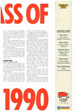
7.6 tonnes-17 tonnes Few operators would choose a skip loader vehicle as a starting point for a winning livery, but that's exactly what Topmix Mortars did. The bold stripes on the Freighter 17-tonner quickly grabbed the judges' attention. "Really imaginative," "distinctive" and "eye-grabbing" were just some of the superlatives tossed about.
Again it was noted that the effectiveness of the design would depend heavily on how clean the vehicle was kept. But there was no doubt that Topmix had managed to turn the least likely entry into a highly individual winner.
Back to more conventional vehicles: Trehor Bassett's box van took second place. "Restrained hut effective", was how Harris described it. "Well drawn and a good choice of colours" was Deery's reaction.
After winning a commendation in Class One, Lynx Express moved up a place to get third prize in Class Two where in this case bigger definitely meant better.
The unusual design of a cream cracker box breaking out of the side of a truck earned The Jacobs Bakery a commendation, although our judges were divided over whether it finally carried it off. "You've got two different planes working
against each other, but the perspective is interesting," said Green.
The recently launched Parcel Force logo also grabbed a commendation for the Royal Mail. "Very powerful," said Jones. "It's managed to create a new feeling for the company without detracting from the traditional pillar box red on the vehicle. It's still a Royal Mail truck."
Some liveries that don't get prizes do at least get noticed. Christie-Tyler's rigid got a lukewarm reception in terms of overall design, but it rates a mention in terms of safety because the use of reflective lettering ensures that it is clearly visible at night. Maybe more operators should follow its lead.
For sheer nerve the entry from Swansea's The Brickyard can't be ignored. Almost as one the judges drew a sharp intake of breath in admiration, but it was tempered by a feeling that while it gave a vibrant impression, there were too many elements on it fighting against each other.
CLASS THREE
Vehicles over 17 tonnes GVW
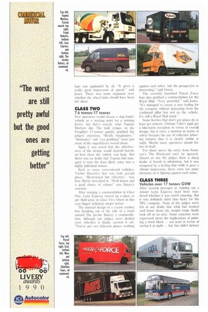
After several attempts at running out a winner Lynx Express must have wondered whether it was worth entering. But it was definitely third time lucky for the NFC company. None of the judges were left in any doubt that what had worked well lower down the weight range finally took off on an artic. Some concerns were expressed about the implications of painting a truck black — not least in terms of seeing it at night — but that didn't detract
from the unanimous verdict: "If the side stripe was reflective then that would make it 110%," said Weatherley.
In second place Royal Mail Parcel Force proved that anything Lynx could do, it could do too. Jones was adamant that the Parcel Force logo gained greater impact when it was spread across a 12m semitrailer.
Not many people would have thought of entering a mixer in a livery competition. Topmix did and once again proved that it wasn't what you entered but what you did with it that counted. "It looks like somebody enjoyed doing it," said Green.
As the overall quality of entrants in Class Three was highgthere were a number of commendations for companies which just failed to make it. It was small details, however, that finally eased them out of the top three.
Yeoman Aggregates, a previous livery award winner, was one of the favoured. "Strong, no-nonsense" was one opinion. Buchan Meat's choice of colours, including an organic green, met with the panel's approval, although the use of different typefaces and logos let it down. "It's not there, but it has got some nice qualities," said Harris. "It looks as if two designers have worked on it, although not together," was Green's attitude.
Exel Logistics chose silver for its latest livery, not least because it goes with just about everything. This is an important consideration when Exel tractors are hauling customers' trailers carrying their own liveries. The judges felt that the side of the trailer didn't quite match up to the front, however, particularly in the use of the red stripe in the logo.
The effectiveness of the Cert design seemed to diminish in the higher weight classes. Our judges preferred it on a van or on a rigid but the overall approach was still "consistent", according to Deery.
The giant Mars bars from Mars Confectionery also rated a commendation, but it was undermined by the white tractor.
Also commended in the class was Sooner Foods with its Crunchy Fries on one side of the semi-trailer. "They do look good" said Harris. But in the end the snacks portrayed on the other side of the trailer looked less appetising, so out it went. Fox's Biscuits was another entrant whose semi-trailer, complete with Classic livery, looked good; but without a tractor to show how the complete rig looked it fell by the wayside.
CLASS FOUR
Passenger Service Vehicles Last year our judges were so disappointed by the standard of entries in the PSI/ sector that they decided not to make any awards. This year our panel had no such problem.
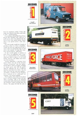
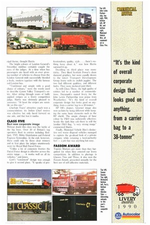
The clear winner was Western Scottish Omnibuses: "Most people would probably shy away from colours like black, white and grey and go for something stronger . . . but Western has put them together to produce a really high-class image," said Jones. The Western design had style but without diluting a strong muni cipal theme, thought Harris.
The bright colours of London General's Streetline midibus certainly caught the eyes of the judges. At a time when bus passengers are faced with an ever growing number of vehicles to choose from the London General midi successfully blended a lively, modern typeface with the famous red London bus, "Traditional and simple with a good choice of colours," were the words used to describe Cynon Valley Transport's entry. After sitting through years of badly applied stripes as a livery competition judge. Harris was obviously pleased to announce: "At least the stripes are sensible on this one."
Chieftain Tours' attractive coach won a commendation: its Indian Chief motive was effective but only faced forward on one side, and that lost it marks.
CLASS FIVE
Best new corporate image Without doubt this class was the battle of the big boys. Over 30 of Britain's top operators fired in entries including Redland. TNT, Bibby Distribution and Federal Express Systemline. In the end, however, there could only be three clear winners and in first place the judges unanimously went for Royal Mail Parcel Force.
"Unlike a lot of corporate liveries the Parcel Force design is effective across the entire range . . . it wOrks well on all its vehicles," said Jones.
Cert's "consistent" design was enough to give it second place. "It speaks of pro
fessionalism, quality, style . . there's nothing fussy about it," was how Harris summed it up.
Deciding on third place was more tricky. They liked Scottish Power's clean diamond graphics, but were equally drawn to the latest Transport Development Group livery with its stylish juggler. The two had different qualities, and different faults, They were declared joint third.
As with Class Three, the high quality of entries led to a number of commendations. Duramark's muted livery for the John Lewis Partnership won praise from Weatherley: "It's the kind of overall corporate design that looks good on anything, from a carrier bag to a 38-tonner."
BP Oil's cleaner, Greener image also won acclaim by being different while keeping the same basic elements such as the BP shield. The simple changes of base colour by P&O was sufficiently effective; beside the dark blue cab there is still the familiar P&O flag, "a very strong image" commented Harris.
Finally, Municipal Vehicle Hire's distinctive red waste disposal vehicles managed to capture the go-ahead look of a private company while retaining a local-authority feel — a job that was anything but easy.
FASSON AWARD
Topmix Mortars got more than they bargained for when they entered our livery competition. In addition to placings in Classes Two and Three, it also won the Fasson Award, presented annually for the best use of self-adhesive materials.


