olour sets off line winning liveries
Page 51

Page 54

If you've noticed an error in this article please click here to report it so we can fix it.
urier Express takes the judges' decision on ioints after a closely run competition
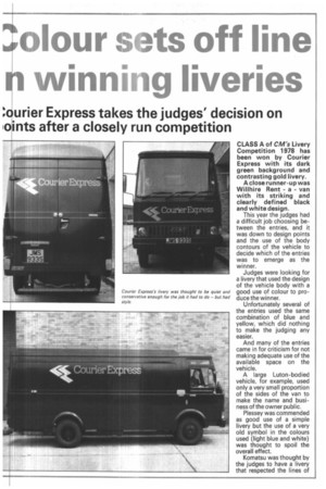
CLASS A of CM's Livery Competition 1978 has been won by Courier Express with its dark green background and contrasting gold livery.
A close runner-up was Willhire Rent a van with its striking and clearly defined black and white design.
This year the judges had a difficult job choosing between the entries, and it was down to design points and the use of the body contours of the vehicle to decide which of the entries was to emerge as the winner.
Judges were looking for a livery that used the design of the vehicle body with a good use of colour to produce the winner.
Unfortunately several of the entries used the same combination of blue and yellow, which did nothing to make the judging any easier.
And many of the entries came in for criticism for not making adequate use of the available space on the vehicle.
A large Luton-bodied vehicle, for example, used only a very small proportion of the sides of the van to make the name and business of the owner public.
Plessey was commended as good use of a simple livery but the use of a very old symbol in the colours used (light blue and white) was thought to spoil the overall effect.
Komatsu was thought by the judges to have a livery that respected the lines of the vehicle but some of the judges thought that it was a little brash in its use of graphics.
The entry was commended for being colourful and for relating the lines of the livery to the lines of the vehicle.
Winners in the class were commended for having achieved exactly what the livery was intended to achieve. The Courier Express design, thought the judges, had the necessary movement needed to convey the idea "express" — yet the design was also conservative enough for the world of banking which the company serves.
Willhire was a livery that was sympathetic to the lines of the new Ford Transit and looked clean with its contrasting black stripe.
This design was in the running to win the class except that the judges considered the rear view of the vehicle with its black panel ending in a silhouette map of East Anglia to be a little unidentifiable. Standard in the second Class A competition was up to the usual standard that CM has come to expect from entrants and judges are finding that they must deliberate more than ever to find a winner as the task becomes more difficult.
The judges were very impressed by one entry from Archery Developments which made use of customising techniques, but they were unanimous in saying that it would be almost unrepeatable on a second vehicle.
The design and colours were much admired, but like all works incorporating individuality and art, it would not be suitable for a fleet.
But the judges also added that they thought with a name like Archery Developments it should have been possible to present a clear cut logo including a target instead of the present illustrations which were thought to lack some definition.


