 1
1 2
2 3
3 4
4 5
5 6
6 7
7 8
8 9
9 10
10 11
11 12
12 13
13 14
14 15
15 16
16 17
17 18
18 19
19 20
20 21
21 22
22 23
23 24
24 25
25 26
26 27
27 28
28 29
29 30
30 31
31 32
32 33
33 34
34 35
35 36
36 37
37 38
38 39
39 40
40 41
41 42
42 43
43 44
44 45
45 46
46 47
47 48
48 49
49 50
50 51
51 52
52 53
53 54
54 55
55 56
56 57
57 58
58 59
59 60
60 61
61 62
62 63
63 64
64 65
65 66
66 67
67 68
68 69
69 70
70 71
71 72
72 73
73 74
74 75
75 76
76 77
77 78
78 79
79 80
80 81
81 82
82 83
83 84
84 85
85 86
86 87
87 88
88 89
89 90
90 91
91 92
92 93
93 94
94 95
95 96
96 97
97 98
98 99
99 100
100 101
101 102
102 103
103 104
104 105
105 106
106 107
107 108
108 109
109 110
110 111
111 112
112 113
113 114
114 115
115 116
116 117
117 118
118 119
119 120
120 121
121 122
122 123
123 124
124 125
125 126
126 127
127 128
128 129
129 130
130 131
131 132
132 133
133 134
134 135
135 136
136 137
137 138
138 139
139 140
140 141
141 142
142 143
143 144
144 145
145 146
146 147
147 148
148 149
149 150
150 151
151 152
152 153
153 154
154 155
155 156
156 157
157 158
158 159
159 160
160 161
161 162
162 163
163 164
164 165
165 166
166 167
167 168
168 169
169 170
170 171
171 172
172 Matthew Brown brews up a real winner
Page 120
Page 121
Page 122
If you've noticed an error in this article please click here to report it so we can fix it.
The brewers Lelebrate their 150th anniversary in fine st by coming first in (r■A's middleweight livery competition lohn Durant was there
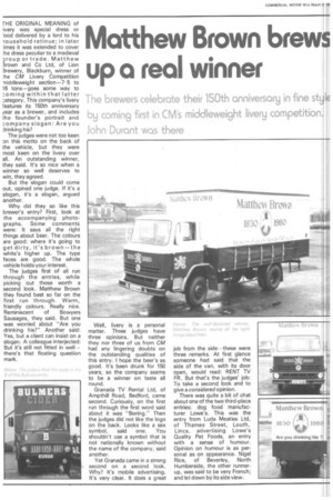
[HE ORIGINAL MEANING of ivery was special dress or bod delivered by a lord to his -iousehold retinue; in later :imes it was extended to cover :he dress peculiar to a medieval roup or trade. Matthew Brown and Co Ltd, of Lion Brewery, Blackburn, winner of :he CM Livery Competition Tiiddleweight section-7.5 to 16 tons—goes some way to :oming within that latter :ategory. This company's livery Features its 150th anniversary year as a brewer, and includes the founder's portrait and :ompany slogan: Are you drinking his?
The judges were not too keen on this motto on the back of the vehicle, but they were most keen on the livery over all. An outstanding winner, they said. It's so nice when a winner so well deserves to win, they agreed.
But the slogan could come out, opined one judge. If it's a slogan, it's a slogan, argued another.
Why did they so like this brewer's entry? First, look at the accompanying photographs. Some comments were: It says all the right things about beer. The colours are good: where it's going to get dirty, it's brown—the white's higher up. The type faces are good. The whole vehicle holds your interest.
The judges first of all run through the entries, while picking out those worth a second look. Matthew Brown they found best so far on the first run through. Warm, friendly colours. Really nice. Reminiscent of Bowyers Sausages, they said. But one was worried about "Are you drinking his?" Another said: Yes, but a client can insist on a slogan. A colleague interjected: But it's still not fitted in well — there's that floating question mark. Well, livery is a personal matter. Three judges have three opinions. But neither they nor three of us from CM had any lingering doubts on the outstanding qualities of this entry. I hope the beer's as good. It's been drunk for 150 years, so the company seems to be a winner on taste all round.
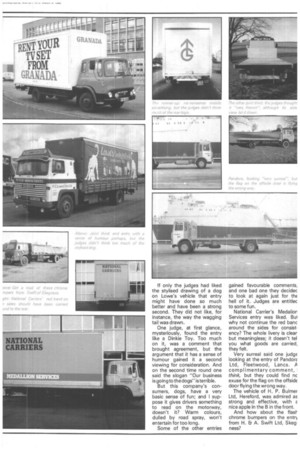
Granada TV Rental Ltd, of Ampthill Road, Bedford, came second. Curiously, on the first run through the first word said about it was "Boring." Then the judges did not like the logo on the back. Looks like a sex symbol, said one. You shouldn't use a symbol that is not nationally known without the name of the company, said another.
Yet Granada came in a strong second on a second look. Why? It's mobile advertising. It's very clear. It does a great job from the side—these were three remarks. At first glance someone had said that the side of the van, with its door open, would read: RENT TV FR. But that's the judges' job: To take a second look and to give a considered opinion.
There was quite a bit of chat about one of the two third-place entries: dog food manufacturer Lowe's. This was the entry from Luda Meaties Ltd, of Thames Street, Louth, Lincs, advertising Lowe's Quality Pet Foods, an entry with a sense of humour. Opinion on humour is as personal as on appearance. Nigel Rice, of Beverley, North Humberside, the other runnerup, was said to be very French; and let down by its side view. If only the judges had liked the stylised drawing of a dog on Lowe's vehicle that entry might have done so much better and have been a strong second. They did not like, for instance, the way the wagging tail was drawn.
One judge, at first glance, mysteriously, found the entry like a Dinkie Toy. Too much on it, was a comment that brought agreement, but the argument that it has a sense of humour gained it a second viewing for consideration. And on the second time round one said the slogan "Our business is going to th e dogs" is terrib le.
But this company's consumers, dogs, have a very basic sense of fun; and I suppose it gives drivers something to read on the motorway, doesn't it? Warm colours, dulled by road spray, won't entertain for too long.
Some of the other entries gained favourable comments, and one bad one they decidec to look at again just for the hell of it. Judges are entitlec to some fun.
National Carrier's Medalior Services entry was liked. Bui why not continue the red banc around the sides for consistency? The whole livery is clear but meaningless; it doesn't tel you what goods are carried, they felt.
Very surreal said one judge looking at the entry of PandorE Ltd, Fleetwood, Lancs. A complimentary comment, I think, but they could find nc exuse for the flag on the offside door flying the wrong way.
The vehicle of H. P. Bulmer Ltd, Hereford, was admired as strong and effective, with E nice apple in the B in the front.
And how about the flea chrome bumpers on the entr), from H. EiA. Swift Ltd, Skeg ness?
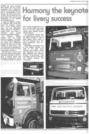
WRING last year's Scottish /lotor Show, we ran a livery ompetition with a difference. -*teed of inviting operators to end in photographs of their ehicles, we sent staff photoirapher Brian Weatherley ound Kelvin Hall, and he took ihotographs of the exhibits vhich caught his eye.
It gave our judges a tougher )13, because they could only ssess the vehicles' impact rom a front three-quarter ngle. But the signwritten veries—typical of Scotland— spired them and those in :ontention were quickly educed to a shortlist of three. The Muirpark Seddon ktkinson won on overall iarmony of design. The judges ked the traditional approach, he subtle tone difference retween the reds, and the high tandard of gold lining. The very delivered its message with he minimum of fuss and there vas no clash of colours.
Montgomery's purple and reen cab captured the judges' magination enough for them to )lace it second equal with 3uchanan's whisky lorry. It was courageous decision to adopt such a colour combination on a lorry, and the effect was spoilt only by the lurid yellow cab interior which clashed horribly with the exterior.
The Buchanan vehicle was very restrained and simple, but the effect worked. It was a good design which failed to win only because such simplicity demanded "spot on" sig nwriting.
Signwriting weaknesses had in fact already weeded out most of the other show vehicles. The Pollock vehicle was traditional, but had not been designed with sufficient thought. "It just evolved," said the judges, and the Turner light van looked striking, but unattractive.