 1
1 2
2 3
3 4
4 5
5 6
6 7
7 8
8 9
9 10
10 11
11 12
12 13
13 14
14 15
15 16
16 17
17 18
18 19
19 20
20 21
21 22
22 23
23 24
24 25
25 26
26 27
27 28
28 29
29 30
30 31
31 32
32 33
33 34
34 35
35 36
36 37
37 38
38 39
39 40
40 41
41 42
42 43
43 44
44 45
45 46
46 47
47 48
48 49
49 50
50 51
51 52
52 53
53 54
54 55
55 56
56 57
57 58
58 59
59 60
60 61
61 62
62 63
63 64
64 65
65 66
66 67
67 68
68 69
69 70
70 71
71 72
72 73
73 74
74 75
75 76
76 77
77 78
78 79
79 80
80 81
81 82
82 83
83 84
84 85
85 86
86 87
87 88
88 89
89 90
90 91
91 92
92 93
93 94
94 95
95 96
96 97
97 98
98 99
99 100
100 101
101 102
102 103
103 104
104 105
105 106
106 107
107 108
108 109
109 110
110 111
111 112
112 113
113 114
114 115
115 116
116 117
117 118
118 119
119 120
120 121
121 122
122 123
123 124
124 125
125 126
126 127
127 128
128 129
129 130
130 131
131 132
132 133
133 134
134 135
135 136
136 137
137 138
138 139
139 140
140 Designing a corporate identity for a coach fleet
Page 41
Page 43
If you've noticed an error in this article please click here to report it so we can fix it.
by Gordon Green*
OR a service company, what really natters is how quickly it is identified and vhat it is identified as. Who you are as )pposed to whai you are, is a precise but mportant distinction. It means little if a :asual passer-by deduces that a coach with name on it is run by a coach company. f hat is merely what you are, and should )e obvious. But if the passer-by reacts by -emembe ring "Ahl Brown's Coaches — .hat friendly, efficient firm I travelled with ast year", 'then that matters. That is WHO you are.
In the jargon of the business world, this is your image. Your image is strong when [t is visually reinforced by every means at your disposal and it is good when you run friendly and efficient concern. Equally, of ::ourse, if your enterprise is neither friendly or efficient, the introduction of a corporate identity will only strengthen a bad image. So no miracles are to be had by superficially smearing the pretty make-up of colour and symbols over the ugly face of an inefficient business enterprise.
However, justifiably assuming that all who read this are involved in operations whose continued survival implies the existence of efficiency and friendliness, let us direct our attention to the separate visual elements which provide the basic structure of a corporate identity programme. These are the company colour, the symbol and the logotype. (The logotype is the company name shown in a specific letter style and consistently used in this form.) The company colour More than any other field of commercial enterprise, transport companies, and particularly coach companies, have had an historic awareness of the impact of colour as a speedy means of establishing identity. In writing for experienced operators in the coach business, there is little one can say about the merits of one colour over another. However, should the renewal of one's existing livery be considered, it is very important to bear in mind that unless there are powerful reasons for doing so, the existing colour should not be changed. Otherwise the public recognition, built up over the years from the consistent use of a livery, will be thrown away.
If you do decide to change the colour, the new one should be selected for objective reasons rather than a purely subjective one, for instance that you or your wife like it, Therefore consider the following points:— The colours of the coach companies who operate in competition with and in proximity to your own company.
O The possibilities of local or political
prejudice against a colour.
OThat the colour conforms to British Standards. The choice of a fashion colour that may be discontinued after a year or so, can lead to difficulties in the future.
O Choose a colour that has an available match in both coach paints and printing inks. While a printer can mix inks to match most colours, there are inevitably undesirable variations. In making this choice, your printer will be able to help by showing you the range of colours he can acquire direct from the ink manufacturer as a standard production line.
Having reduced your colour choices to a short list, leave your final decision until you have given thought to the symbol and logotype, as these may well look better in one rather than the others of your shortlisted colours. Also, your stationery will more than likely be printed on white paper with possibly some black type, with the symbol and logotype shown in the company colour. Assuming it looks well on the coaches, then when all else fails, the colour that looks best on your stationery can help you make the final choice.
The symbol A symbol should be original and identifiable. The more it looks like the symbol of other organizations, the less it will identify your company. The symbol can be inspired by some aspect of the business you are involved with. This is not to suggest that because you are involved with transport, you should turn to the wheel as your inspiration. Rather should you ask searching questions as to the true nature of your operation as you wish to project it to the public.
Do you operate sight-seeing tours for a clientele largely comprising older age groups or do you operate largely on a hire basis? This problem of associating your symbol with your company's prime activity is very restrictive. Very few companies actually achieve success. British Rail comes to mind as one of the few successful ones, but they have a monopoly.
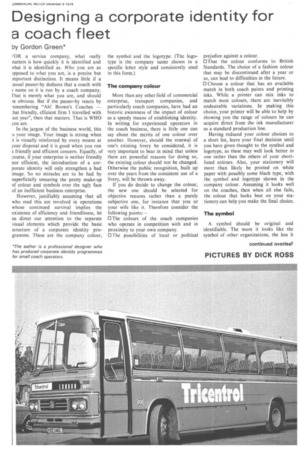
Alternatively, a symbol can be based on the initial letter or letters of the company's name. Distinction is achieved by manipulating the letters to achieve a unique representation. National Bus is a good example.
AZ Az Az Why not look to tradition for ideas? A firm in Nottingham could base its symbol on the bow and arrow, with its connotations of Robin Hood. Bear in mind, however, that a symbol based on too local a tradition will have no viability if you operate nationwide.
Having decided the theme for the symbol, refine it to meet the following requirements:— 1 ) It should be simple. Complex detail disappears with distance and blurs when passing at speed. Also, while you will periodically change your fleet to keep it modern, your symbol will stay the same and the simpler the symbol, the more timeless it remains.
2) For economy when applied to letterheads, etc, the symbol should be reproducible in one colour.
3) For variety, it helps if the symb,o1 can be reproduced in outline. While not immediately obvious, it can be an asset when it is required to be shown large but not necessarily bold, for instance on posters and sales literature.
The logotype
A logotype can, and often does, replace a symbol and provided a logotype with a distinctive enough form can be developed for your company. there is no need to have a symbol. The logotype has the advantage of always projecting the company's name and, unlike the symbol, does not have to be translated through association of ideas. For the sake of impact, it is better to use the main company name only in the logotype, ie a company named John Brown & Sons Ltd would use the word "Brown". The full company name can be shown small, underneath. Legally, of course, the ownership details must appear on the nearside. Points 1.2 and 3 governing the creation of a symbol apply equally to a logotype.
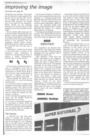
Choosing an appropriate letter style is not easy. If you study different styles of lettering, you will become aware that some look bold and aggressive, others
BOID
REFINED
look insignificant and between these extremes lies a vast range from which a choice can be made. I would not advise designing one's own lettering. That is decidedly an expert's job.
After selecting a letter form you believe appropriate to the company's image, you must decide whether to display the name in capital letters or small letters (lower case). This depends somewhat on the name involved. Try both and see. One school of thought believes that a logotype will be most effective as an identifying element, if the shape of the letters gives a distinctive form to the logotype. In example a) neither word shape is much more distinctive than the other, therefore the larger lettering you achieve using all capitals, would be the more advantageous. In example b) we have a different situation. Use of the lower case letters gives the name a very shapely outline which will assist immediate identification.
anovvail *wont
INARDINGS
In the main, vaienever you need to us a colour, then use the company colout This applies to signs, printed matte/ uniforms and to some extent offic decor, at least when exposed to the put lic eye. Your logotype or symbol shout be displayed on every possible medium If the two are shown together, giv priority of emphasis to the symbol Following is a list of likely areas fa expressing the visual elements. Vehicle signs, uniforms, badges and buttom letterheads, visiting cards, fortm rubber stamps, tickets, timetable labels, franking marks, head rests am all advertising and promotiona literature.
Having had placed before you jth some of the problems inherent in a enterprise of this nature, you wi appreciate the extent of the detai research and thought that conceiving corporate identity involves. If yo attempt the preliminaries yourself, yo will certainly need a studio to produc the rough visuals and the finished draw ings. The problems can be take completely from your shoulders by pia( ing the whole programme in the hand of a competent commercial studio. Bu while the graphic designer ca anticipate technical problems, produc . the designs and ask the right questiono you, and only you, can give the righ answers. And upon the accuracy wit which your answers pinpoint your corn mercial needs, depends the mhol viability of a corporate identity prc gramme.
It can be a powerful marketing tool a merely an expensive face-lift.