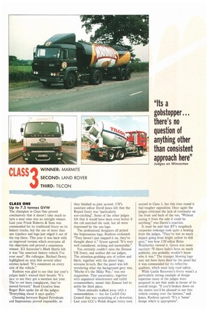
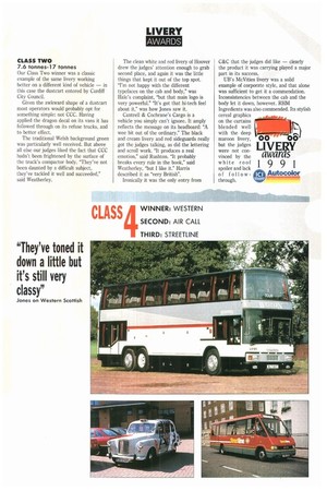
"Its a gobstopper there's no question of anything other than consistent approach here"
Page 38

Page 39

If you've noticed an error in this article please click here to report it so we can fix it.
Judges on Wincanton
Our Class Two winner was a classic example of the same livery working better on a different kind of vehicle — in this case the dustcart entered by Cardiff City Council.
Given the awkward shape of a dustcart most operators would probably opt for something simple: not CCC. Having applied the dragon decal on its vans it has followed through on its refuse trucks, and to better effect.
The traditional Welsh background green was particularly well received. But above all else our judges liked the fact that CCC hadn't been frightened by the surface of the truck's compactor body. "They've not been daunted by a difficult subject, they've tackled it well and succeeded," said Weatherley. The clean white and red livery of Hoover drew the judges' attention enough to grab second place, and again it was the little things that kept it out of the top spot. "I'm not happy with the different typefaces on the cab and body," was Hale's complaint, "but that main logo is very powerful." "It's got that hi-tech feel about it," was how Jones saw it.
Cantrell & Cochrane's Cargo is a vehicle you simply can't ignore. It amply reflects the message on its headboard: "A wee bit out of the ordinary." The black and cream livery and red sideguards really got the judges talking, as did the lettering and scroll work. "It produces a real emotion," said Rushton. "It probably breaks every rule in the book," said Weatherley, "but I like it." Harris described it as "very British".
Ironically it was the only entry from C&C that the judges did like — clearly the product it was carrying played a major part in its success.
UB's McVities livery was a solid example of corporate style, and that alone was sufficient to get it a commendation. Inconsistencies between the cab and the body let it down, however. RHM


