


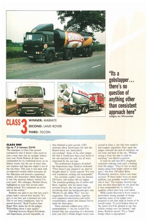
CLASS ONE Up to 7.5 tonnes GVW
Page 38
If you've noticed an error in this article please click here to report it so we can fix it.
The champion in Class One proved conclusively that it doesn't take much to turn a near miss into an outright winner. Last year Frank Roberts & Sons was commended for its traditional livery on its bakery trucks, but the use of more than one typeface and logo just edged it out of the top three, This year it was back with an improved version which overcame all the objections and proved a unanimous winner. ICI Autocolor's Mark Harris felt it was "the smartest bakery vehicle I've ever seen". His colleague, Rachael Decry, highlighted an area that several other entries lacked: "It's consistent on every side of the vehicle."
Rushton was glad to see that last year's judges hadn't wasted their breath: "It's nice to see they got a mention last year. The've not been complacent, they've moved forward." Reed Creative boss Roger Hale spoke for all the judges: "Everything about it says quality."
Choosing between Repsol Petroleum and Impressions proved impossible, so
they finished as joint second. CM'S assistant editor David Jones felt that the Repsol livery was "particularly eye-catching". Some of the other judges felt that it would have been even better if the cab matched the tank, but all were impressed by the sun logo.
The professional designers all picked the Impressions logo. Rushton reckoned: "They haven't just slapped it on, they've thought about it." Green agreed: "It's very well considered, striking and memorable."
You certainly couldn't miss the Zanussi UK livery, and neither did our judges. The attention-grabbing mix of yellow and black, together with the planet logo, screams hi-tech. But the panel was left wondering what the background grey was. "Maybe it's the Milky Way," was one suggestion. That uncertainty, together with unpainted wheelcovers and taillift crossmembers, meant that Zanussi had to settle for third place.
Three entrants walked away with a commendation — but for Cardiff City Council that was something of a demotion. Last year CCC's Welsh dragon livery took second in Class 1, but this time round it had tougher opposition. Once again the judges criticised the lack of continuity on the front and back of the van. "Without seeing it from the side it could be anything," was Harris's reaction.
It must be said that BT's megabuck corporate redesign took quite a beating from the judges. "They've lost so much impact going from bright yellow to dull grey," was how CM editor Brian Weatherley viewed it. Green was more succinct: "If there hadn't been so much publicity, you probably wouldn't know who it was." The trumpet blowing logo may not have been liked by the panel but it was commended for its reflective qualities, which must help road safety.
While Castle Recovery's livery wasn't a particularly strong example of design expertise many of the judges were prepared to put that aside in favour of its overall image. "If you'd broken down on the moors you'd be pleased to see that vehicle coming over the horizon," said Jones. Rushton agreed: "It's a 'home' design which is appropriate".