


RSKY and Hutch stripes on icle livery are out, apparently;
Page 32
Page 33
If you've noticed an error in this article please click here to report it so we can fix it.
the three-dimensional effect . This is a change that met with royal from our livery competipanel when they judged the ries in the CM light vehicle ss.
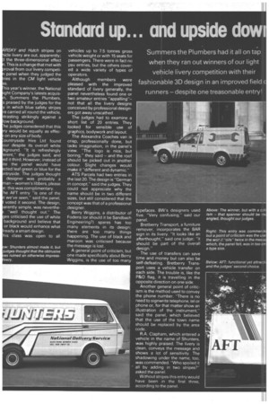
his year's winner, the National ight Company's latests acquisn, Summers the Plumbers, s praised by the judges for the y in which blue safety stripes re carried all round the vehicle, trasting strikingly against a low background.
he judges considered that this ry would be equally as effecon any size of body.
ountryside Hire Ltd found our despite its overall white kground, "It is refreshingly erent," the judges said, and ed it third. However, instead of ite the panel would have cted leaf green or blue for the ntryside. The judges thought designer was probably a man -women's libbers, please e: this was complimentary.
he AFT entry "is one of the t we've seen," said the panel, voted it second. The design, arently simple, was neverthe"well thought out." The es criticised the use of white background and believe that or black would enhance what !ready a smart design.
his class was open to all vehicles up to 7.5 tonnes gross vehicle weight or with 15 seats for passengers. There were in fact no psv entries, but the others covered a wide variety of types of operators.
Although members were pleased with the improved standard of livery generally, the panel nevertheless found one or two amateur entries "appalling"not that all the livery designs conceived by professional designers got away unscathed.
The judges had to examine a short list of 20 entries. They looked for sensible use of graphics, bodywork and layout.
The Alexandra Coaches van is crisp, professionally done, but lacks imagination, in the panel's view. "The logo is nice, but boring," they said and the roof should be picked out in another colour. Slight changes would make it "different and dynamic."
ATS Parcels had two entries in the last 20. The design is "German in concept," said the judges. They could not appreciate why the name should be in two different sizes, but still considered that the concept was that of a professional ,designer.
Berry Wiggins, a distributor of Fodens (or should it be Sandbach Engineering?) spares has too many elements in its design; there are too many things happening. The use of black and maroon was criticised because the message is lost.
A general point of criticism, but one made specifically about Berry Wiggins, is the use of too many typefaces. BW's designers used five. "Very confusing," said our panel.
Bretberry Transport, a furniture remover, incorporates the BAR sign in its livery. "It looks like an afterthought," said one judge; "it should be part of the overall design."
The use of transfers can save time and money but can also be self-defeating. Bretberry Transport uses a vehicle transfer on each side. The trouble is, like the P&O flag, it is travelling in the opposite direction on one side.
Another general point of criticism is the method used to convey the phone number. "There is no need to signwrite telephone, tel or phone or, for that matter show an illustration of the instrument," said the panel, which believed that the use of the town name should be replaced by the area code.
R.A. Clapham, which entered a vehicle in the name of Shunters, was highly praised. The livery is clean, conveys the message and shows a lot of sensitivity. The shadowing under the name, too, was commended. "Who spoiled it all by adding in two stripes?" asked the panel.
Without stripes this entry would have been in the first three, according to the panel. Above: The winner, but with a cri1 ism that spanner should be m angled, thought our judges.
Right: This entry was commend but a point of criticism was the use the word -oils" twice in the messa which, the panel felt. was in too sm a type size.
The City-Link British Rail Red Star parcels van appeared to bring together most of the judges' general criticisms. There are too many elements, too many colours and too many typefaces. The spacing is bad, the colours unharmonious. One judge thought it was probably the worst livery he had encountered in the competition.
The Coventry Boring and Metalling Co design, they said, lacks imagination, and it seemed odd to them that the painter should use gold leaf for the body lettering and yellow for the doors. The metallic colour used for the crankshaft illustration is confusing, they felt.
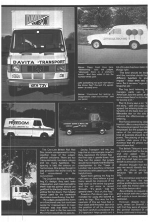
The judges accepted this livery as a functional one, but could see scope for improvement. A major criticism was that there is too much to read in the five seconds the vehicle would take to pass by. Davita Transport fell into the trap that so many people do when they reproduce the Union flag the firm uses it upside down. Had they had the power, the judges would have dispatched he Davita coachpainter to the Tower of London! As it was they contented themselves with passing on a few helpful hints.
Apart from getting the flag the right way up, they believe a good livery would be improved if the logo took up the entire top panel and the red stripe is carried through. "It's good," was the general view-'but, oh, that flag !"
Freedom Petroleum was commended for using the bonnet to carry its logo. This was the first example of this we have had in four years and the panel says that the position of all the elements has been carefully considered, the 3-D approach helps greatly and a lot of trouble has been taken t things right.
"The bird should be isol and the narrative should be different typeface to giv impact"these were two c isms. But it remains "a good, fessional job."
The big bold lettering o Garages parts van is American, said the panel, and some cases there's a lot to be for saying a lot."
The HL livery says a lot. "It the story," said one judge, b agreed the lettering looks tin fortable an the back door an Mercedes star on the side reduces the effectiveness o lettering.
The Honda entered by Jew Honiton offers unexploited sc The colours are good, the lett misplaced. But the judges fee name of the company and type of business should be t posed. The placing of the sq number plate gives it the minence that the phone nu should have had.
The British Telecom's ent not commend itself to the ju and one asked: "Are ashamed of being British?' said the small type size use British is almost an insult.
Another thought that the way we would identify the I with the phone service because "We all get Tel bills."
The concensus was that th should be blue, the lett yellow and the same size thr out, with the morse code c round the bottom skirt.
Any entrants on request c put in touch with the judges will supply a more detailed I appraisal.
However, despite their isms, writes Ian Sherriff, I add that they were all agree the general standard of v livery continues to improve.