ON THE HORIZON
Page 54

Page 55

Page 56

If you've noticed an error in this article please click here to report it so we can fix it.
FleetHorizon is a multi-user, multi-depot fleet
management software package being launched by CFC Solutions. So will it help broaden your fleet management horizons? Robin Meczes finds out.
Software of any kind these days, whether business or consumer, should always he clearly presented and intuitive to use not least because packages that are hard work aren't going to get very far in an age when nobody has any time to spare on learning new procedures.And why should they, after all, when there are certain well-established ways of going about things?
Enter Fleetflorizon, a new package from CFC Solutions that should. by the time you read this, have been launched at the Commercial Vehicle Show.
FleetHorizon sits in CFC's software line-up between FleetOutlook, its entry-level, singleuser fleet management package, and FleetPlus, its top-end, multi-user, multi-depot system. FleetHorizon is also multi-user and multidepot -it will cater for up to 500 vehicles but several bits have been lopped off when compared with FlectPlus.These, we're told, include digital tachograph integration,P11D functionality, additional driver information and a comprehensive customer relationship management (CRM) module.
What's left is still a pretty good dose of fleet management functionality, however. This ranges from information about your vehicles and drivers to operating costs and fuel card management; from mileage logs and servicing information to insurance policy details; and from accident and roadside inspection recording to the number of vehicles currently authorised on your operator's licence.
The level of detail you can go into on all these issues is suitably exhaustive and there's a basic but functional integrated reporting capability to help you make sense of it all, once the data is in.
There's also a feature that lets you link certain parts of the software to certain documents outside it. For example, in the vehicle defect records you can simply press a button to come up with a pre-prepared fax to send to your workshop asking for a fault to be rectified.You can also link records to images, so you can access scanned images of your drivers' licences from within the software, for instance, or any images you may have of your vehicles
Well-received extras
ln addition to all the functionality you'd expect from a system like this, there were two or three areas you don't always see that we really liked. They included the Operator Licence section, into which you can enter all your 0-licence details:licence number, CPC holder, licence review date, traffic area, type of licence, number of vehicles and trailers authorised. We also appreciate the way that breaks down across your different operating centres.
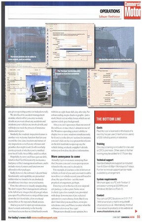
And when you enter new vehicles and start allocating them to particular depots, the software will tell you if you exceed the limit at any given operating centre (or indeed overall).
We also liked the accident management module, which will let you enter as many details as you want about any accidents and incidents your vehicles are involved with, and will help you track the process of insurance claims and repairs.
Similarly, the roadside inspection feature is another very welcome function that lets you record the time, date, location and nature of any inspections as well as any offences and penalties that might result. It will even help you keep track of whether you've notified your localTraffic Area Office and if so, when.
Hopefully, by now you'll have got our drift, which is that FleetHorizon is by no means a had piece of fleet management software, and it includes many features and functions not offered in other packages.
Sadly, however, the software's decent basic functionality and capability are presented within what we found to be an absolutely dreadful user interface on several scores.
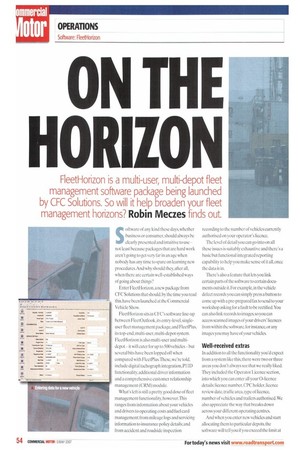
First, the software is visually unappealing. We don't expect fleet management software to be full of sexy images, but all you get when you open FleetHorizon is a strip of blue icons down the left-hand si de, a few overhead menu titles at the top and a blank screen.
And as you start to open up various areas there's a stark uniformity to the heavily text-based screens that we'd find hard to work with for an eight-hour shift, day after day. No colour coding, no pie charts or graphs —just a stark, black text on white boxes, which are set against a dark-grey background.
Also, you can't open more than one area of the software at once: there's almost no use of the Windows operating system's ability to display two or more windows simultaneously. So if you're in the drivers' section, for instance, you can't click on the ever-present list of icons on the left-hand side to open up. say, the vehicle listing, or check a supplier's details, unless you first close the driver information.
More annoyance to come Actually it gets even more annoying than that, because you can't even open up areas related to the one you're already in.
For example, if you have a list of drivers or vehicles in front of you and you want to add a new driver or vehicle record, you still need to close the open list first — not th.e most practical a rrangement, perhaps.
Entering text in this heavily text-dependent package is also a pain. Some areas (vehicle types, for example) are provided with drop-down menus of pre-selected options for you to choose from. But if you don't find what you need there, or no preselections exist, you'll have to enter what the software refers to as 'free type'.
This process should, in our opinion, be a straightforward process of clicking on the box you want the text to appear in.A blinking cursor should then appear, allowing you to start adding text immediately.
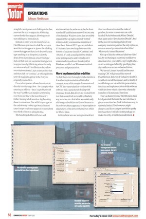
Instead, to enter text into many boxes in FleetHorizon, you have to click the area you want the text to appear in, ignore the blinking cursor that appears there (as it doesn't let you type anything in at this point). select the drop-down menu instead. select 'free type', click on that, wait for a separate free type box to appear nearby (this being almost the only occasion on which FleetHorizon does allow two windows at once), type your text into that and then click on 'continue', at which point the text will magically appear in the box you originally wanted it in.
Even where you are allowed to enter text directly into the target box — for example when entering an address — there's a problem with the way FleetHorizon handles text flowing over from one line to the next. It doesn't bother turning whole words or hyphenating those it cannot turn. Nor will it let you type to the end of many visible type boxes; in most cases it stops you for no apparent reason about two-thirds of the way along the line.
The handling of different boxes and windows within the software is also far from standard. FleetHorizon users will not see any of the familiar Windows icons that invariably appear in the top right corner of 'normal' windows to let you maximise, minimise or close them. Instead, CFC appears to believe it's better to have two large buttons at the bottom of each one (usually 'Continue' and Abort). It's only a small point, but it takes some getting used to and we really can't understand why software developed for Windows wouldn't use Windows-standard processes and presentation.
More implementation oddities
As if all this weren't enough, we also ran into a few other implementation oddities. For example, some of the sample drivers entered by CFC into our evaluation version of the software had a separate tab dealing with insurance details But drivers we created from new had no such tab; nor could we find any way to create one. And while we could easily add images of vehicles and driver licences to the software, there appeared to be no option to add pictures of the drivers themselves, which we'd have liked.
In the vehicle area we were given no fewer than two chances to enter the make of gearbox,for some reason: once on a tab headed Refurbishment8c. Other Details': then again under 'Specification Details'. And in the area for recording details of your company insurance policies, the only option to enter an annual premium is in a box titled 'Motorcycle Annual Premium'.
On top of this, the software failed our 'idiot' test, by not batting an electronic eyelid as we allocated a two-year-old to a top-weight artic... we'd even dropped a hint by specifiying that the toddler was not an authorised driver.
We haven't, it must be said, had the user training CFC will give real-life users of FleetHorizon. But even if we had, we doubt it would sort out all these issues and we doubt it would change our view that the presentation, interface and implementation of this software which let down what is otherwise a basically sound set of features and functions.
That's a shame, because FleetHorizon has a lot of potential. But until the user interface is given an overhaul we think its horizons may be seriously limited. You, however, might disagree, and if you can put up with its quirky interface there's still a lot in this package to make it worthy of further consideration. IN


