 1
1 2
2 3
3 4
4 5
5 6
6 7
7 8
8 9
9 10
10 11
11 12
12 13
13 14
14 15
15 16
16 17
17 18
18 19
19 20
20 21
21 22
22 23
23 24
24 25
25 26
26 27
27 28
28 29
29 30
30 31
31 32
32 33
33 34
34 35
35 36
36 37
37 38
38 39
39 40
40 41
41 42
42 43
43 44
44 45
45 46
46 47
47 48
48 49
49 50
50 51
51 52
52 53
53 54
54 55
55 56
56 57
57 58
58 59
59 60
60 61
61 62
62 63
63 64
64 65
65 66
66 67
67 68
68 69
69 70
70 71
71 72
72 73
73 74
74 75
75 76
76 77
77 78
78 79
79 80
80 81
81 82
82 83
83 84
84 85
85 86
86 87
87 88
88 89
89 90
90 91
91 92
92 93
93 94
94 95
95 96
96 97
97 98
98 99
99 100
100 101
101 102
102 103
103 104
104 105
105 106
106 107
107 108
108 109
109 110
110 111
111 112
112 113
113 114
114 115
115 116
116 117
117 118
118 119
119 120
120 121
121 122
122 123
123 124
124 125
125 126
126 127
127 128
128 129
129 130
130 131
131 132
132 133
133 134
134 135
135 136
136 137
137 138
138 139
139 140
140 141
141 142
142 143
143 144
144 Nothing so gladdens the heart as the news that a
Page 22
If you've noticed an error in this article please click here to report it so we can fix it.
company has a fantastic new corporate logo, thus rendering all our photographs obsolete. All the better when the news is wrapped up in the sort of hyperbolical disquisition that gives designers ("graphic expediters of corporate image enhancement"?) a bad name.
To quote: "The concept of the new logo is that of perpetual motion, to symbolise the forward movement of the company, highlighted by the use of the slanted typeface and directional lines. The use of the ellipse surrounding the typeface signifies the continuous nature of supply chain management... accurately reflecting the dynamism and innovation at the core of Wincanton's business."
We think it means they've drawn an oval, put the "Wincanton" in the middle in italic, drawn a couple of lines under it and coloured the whole shebang blue. A snip at a cost to Wincanton of R40,000.
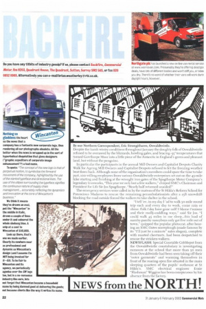
Lank up there, that's one we made earlier. Clearly its nowhere near as professional and dynamic as Wincanton's design (and I assume I'm NOT being invoiced for it—Ed). To be fair to Wincanton and its agency, we periodically agonise Over the CM logo too, but in a no-nonsense industry like ours, lets
not forget that Wincanton became a household name by being damned good at delivering the goods; not because clients like the way it writes its name.