Pie-catching livery lesign brings home bacon
Page 50

If you've noticed an error in this article please click here to report it so we can fix it.
s popular competition ; a lot to encourage a titer image for the road sport industry. The i es this year favoured a e-demensional
.oach, which paid off isomely for Hiniers of icestershire. David ox sat in with the es.
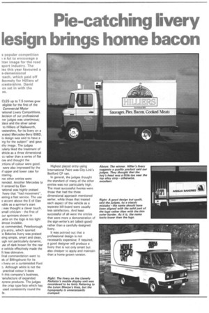
CLES up to 7.5 tonnes gvw eligible for the first of the Commercial Motor iational Livery Competitions. lecision of our professional ner judges was unanimous; )lace and the silver salver to Hilliers of Nailsworth, :estershire, for its livery on a erated Mercedes-Benz 608D. is design was said to have a ing for the subject" and gave ility image. The judges ;ularly liked the treatment of chicle as a three dimensional ct rather than a series of flat ces and thought the Drtions of colour were good. were also impressed by the rf upper and lower case for :ttering.
ree other entries were nended. Another Mercedes la )) entered by Elan iational was highly praised livery that "had movement", esting a fast service. The use e accent above the E of Elan luble as a sprinter's start was thought a clever touch. small criticism the first of Dur sprinters shown in iette on the logo is too light ilmost invisible.
;o commended, Peterborough p's entry, which sported a Bakeries livery was praised eing simple, smart and dean, ugh not particularly dynamic. Ise of dark brown for the rear e vehicle effectively made the ft less obtrusive.
Final commendation went to ek of Billingshurst for its livery on a curtainsided Ford D. Although white is not the practical colour it does h this company's business, lanufacture of expanded .tyrene products. The judges the crisp type-face which has used consistently round the le. Highest placed entry using International Paint was City-Link's Bedford CF van.
In general, the judges thought the standard of many of the other entries was not particularly high. The most successful liveries were those that had the three dimensional approach mentioned earlier, while those that treated each aspect of the vehicle as a separate bill-board were usually less satisfactory. And least successful of all were the entries that were more a demonstration of the sign-writer's art (albeit good) rather than a carefully-designed livery.
It was pointed out that a professional design is not necessarily expensive; if required, a good designer will produce a livery that is not only smart but also cheaper to apply and maintain than a home-grown version.


