 1
1 2
2 3
3 4
4 5
5 6
6 7
7 8
8 9
9 10
10 11
11 12
12 13
13 14
14 15
15 16
16 17
17 18
18 19
19 20
20 21
21 22
22 23
23 24
24 25
25 26
26 27
27 28
28 29
29 30
30 31
31 32
32 33
33 34
34 35
35 36
36 37
37 38
38 39
39 40
40 41
41 42
42 43
43 44
44 45
45 46
46 47
47 48
48 49
49 50
50 51
51 52
52 53
53 54
54 55
55 56
56 57
57 58
58 59
59 60
60 61
61 62
62 63
63 64
64 65
65 66
66 67
67 68
68 69
69 70
70 71
71 72
72 73
73 74
74 75
75 76
76 77
77 78
78 79
79 80
80 81
81 82
82 83
83 84
84 85
85 86
86 87
87 88
88 89
89 90
90 91
91 92
92 93
93 94
94 95
95 96
96 97
97 98
98 99
99 100
100 101
101 102
102 103
103 104
104 105
105 106
106 107
107 108
108 109
109 110
110 111
111 112
112 113
113 114
114 115
115 116
116 117
117 118
118 119
119 120
120 121
121 122
122 123
123 124
124 125
125 126
126 127
127 128
128 129
129 130
130 131
131 132
132 133
133 134
134 135
135 136
136 137
137 138
138 139
139 140
140 WINNER: MILK MARQUE
Page 42
If you've noticed an error in this article please click here to report it so we can fix it.
COMMENDED: WALKERS CRISPS LYNX RELOCOM
It says a lot for the quality of pastwinner Lynx Express's livery that year after year it still manages to catch the judges' eyes. It certainly caught Wilcockson's: "When you see it on the road you know it immediately. But there's no phone numbers—I think that's a missed opportunity." Barrow also thought it "a very consistent message. I've seen it on the road and remembered it. I think they've just missed a trick on the front though."
Harrow Green Removals Group's eye-catching computer-carrying Relocom pantechnicon livery clearly made best use of the vehicle's shape; a point drawn out by Barrow: "Most removals lorries are pretty awful but this is very good. It's a big lorry and they've made full use of the size of the vehicle."
But when it came to details our other judges weren't so sure. "Air-ride suspension is a fairly important thing to say if your moving computers," reckoned Wilcockson, "but they've wasted it."
Gale also felt the logo was "a bit wishy washy. And what's the problem adding Relocom on the front?"
The night-time visibility of Warwickshire Fire and Rescue Service's fire appliance was singled out for a special mention: "That's excellent...there's no way you're going to run into that," said Barrow.
Britvic's "poppie" Tango curtainsider also drew praise from the judges, as did the clean lines of Walker's aerodynamic Leyland Daf rigid. "It's very consistent," thought Wilcockson. Barrow agreed: "They've resisted making any snappy remark about the crisps. If that turns up at your depot you get the feeling the product's been hygienically handled."
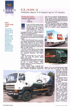
However, for all the impact of the Walkers' livery it was Milk Marque's design which hit the target with the judges, not least as it had to work on a tanker; a point underlined by
Barrow. "It's a very awkward shaped vehicle that's been done very well. The only slight drawback is that the repeat logo on the door is too small. But it's been very well treated. It's innovative and suits the vehicle."
Gale agreed: "They've taken the livery on to the back of the vehicle successfully."
"You can appreciate the work that's gone into it," said Wilcockson, "and you can respect the designer's skills to make it simple. If that vehicle's passing you, even only for a moment, you'll say 'milk'. It communicates cleanliness." It also communicated the ward "winner", our judges had no hesitation in putting it in first place.