 1
1 2
2 3
3 4
4 5
5 6
6 7
7 8
8 9
9 10
10 11
11 12
12 13
13 14
14 15
15 16
16 17
17 18
18 19
19 20
20 21
21 22
22 23
23 24
24 25
25 26
26 27
27 28
28 29
29 30
30 31
31 32
32 33
33 34
34 35
35 36
36 37
37 38
38 39
39 40
40 41
41 42
42 43
43 44
44 45
45 46
46 47
47 48
48 49
49 50
50 51
51 52
52 53
53 54
54 55
55 56
56 57
57 58
58 59
59 60
60 61
61 62
62 63
63 64
64 65
65 66
66 67
67 68
68 69
69 70
70 71
71 72
72 73
73 74
74 75
75 76
76 77
77 78
78 79
79 80
80 81
81 82
82 83
83 84
84 85
85 86
86 87
87 88
88 89
89 90
90 91
91 92
92 93
93 94
94 95
95 96
96 97
97 98
98 99
99 100
100 101
101 102
102 103
103 104
104 105
105 106
106 107
107 108
108 109
109 110
110 111
111 112
112 113
113 114
114 115
115 116
116 117
117 118
118 119
119 120
120 121
121 122
122 123
123 124
124 125
125 126
126 127
127 128
128 129
129 130
130 131
131 132
132 133
133 134
134 135
135 136
136 137
137 138
138 139
139 140
140 141
141 142
142 143
143 144
144 145
145 146
146 147
147 148
148 149
149 150
150 151
151 152
152 153
153 154
154 155
155 156
156 • CLASS THREE
Page 60
Page 61
If you've noticed an error in this article please click here to report it so we can fix it.
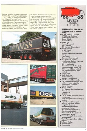
The 17 tonne-plus artic section attracted the biggest number of entries again this year and timber preservative manufacturer Cuprinol won the category with ease. Its design for a drawbar rig was "coherent and clever", thought Weatherley. Olins thought the design made a dull product look interesting, with cute graphics and the use of a timber man to catch the eye.
Turner questioned whether the reflective side logo was legal under the Construction and Use Regulations but the Department of Transport assures us that it is. The judges were also impressed by the way in which the livery design would work once the drawbar trailer had been removed, leaving just the prime mover to carry on alone. All too often, drawbar liveries are well designed for the 'prime mover, but poorly carried through to the trailer but Heuga's smart drawbar entry didn't fall into that trap.
Guinness took second spot with a big, black attic boldly lettered in red and gold and topped off with a cream rear tailgate. "It is confident and strong," said Ohs. "Perfectly realised."
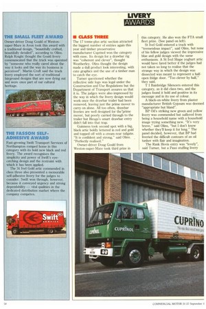
Owner-driver Doug Gould from Weston-super-Mare took third prize in this category. He also won the FTA small fleet prize. (See panel on left).
St Ivel Gold entered a truck with "tremendous impact", said Olins, but none of his fellow judges viewed the impressive blue and gold design with the same enthusiasm. A St Ivel Shape yoghurt artic would have fared better if the judges had not taken so long to realise that the strange way in which the design was dissected was meant to represent a halfopen fridge door. "Too clever by half," they said.
T I Bainbridge Silencers entered this category, as it did class two, and the judges found it bold and positive in its message and in its use of colour.
A black-on-white livery from plaster manufacturer British Gypsum was deemed "appropriate but bland".
BP Oil's striking new green and yellow livery was commended but suffered from being a household name with a household image trying something new. "It's very brave," said ()fins, "but I don't know whether they'll keep it for long." The panel decided, however, that BP had liveried the difficult contours of an oil tanker with flair and imagination.
The Rank Hovis entry was "lovely", said Turner, but a Paxo stuffing livery
from the same RHM Group was deemed "unbelievably dreadful" by Relph Knight.
TNT's livery for brewers Boddington was "elegant", "powerful" and "sympathetic to the product carried". City of Bristol Transport Services also won praise for their new-look refuse collection vehicle design. The judges thought it was a worthwhile attempt to brighten up a usually ditch-water dull truck class. They did wonder, however, how long the look would last under tough conditions.
A Burton Group artic was also singled out for praise. The judges thought that the sample of cloth used in the livery design was a very neat and deft touch.
Fleur-de-Lys brings up the tail section in this class. "It is so muddled," said Olins, "there are too many typefaces and the colours are lousy."