 1
1 2
2 3
3 4
4 5
5 6
6 7
7 8
8 9
9 10
10 11
11 12
12 13
13 14
14 15
15 16
16 17
17 18
18 19
19 20
20 21
21 22
22 23
23 24
24 25
25 26
26 27
27 28
28 29
29 30
30 31
31 32
32 33
33 34
34 35
35 36
36 37
37 38
38 39
39 40
40 41
41 42
42 43
43 44
44 45
45 46
46 47
47 48
48 49
49 50
50 51
51 52
52 53
53 54
54 55
55 56
56 57
57 58
58 59
59 60
60 61
61 62
62 63
63 64
64 65
65 66
66 67
67 68
68 69
69 70
70 71
71 72
72 73
73 74
74 75
75 76
76 77
77 78
78 79
79 80
80 81
81 82
82 83
83 84
84 85
85 86
86 87
87 88
88 89
89 90
90 91
91 92
92 93
93 94
94 95
95 96
96 97
97 98
98 99
99 100
100 101
101 102
102 103
103 104
104 105
105 106
106 107
107 108
108 109
109 110
110 111
111 112
112 113
113 114
114 115
115 116
116 117
117 118
118 119
119 120
120 121
121 122
122 123
123 124
124 125
125 126
126 127
127 128
128 129
129 130
130 131
131 132
132 133
133 134
134 135
135 136
136 137
137 138
138 139
139 140
140 141
141 142
142 143
143 144
144 145
145 146
146 147
147 148
148 149
149 150
150 151
151 152
152 153
153 154
154 155
155 156
156 PA NT YOUR
Page 54
Page 55
Page 56
Page 57
If you've noticed an error in this article please click here to report it so we can fix it.
11111kG014
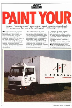
This year's Commercial Motor/ICI Autocolor Livery Awards competition attracted nearly 200 entries, among them some of the most imaginative vehicle designs we have seen.
• More than 40 transport companies gathered in the grounds of Lord Montagu's stately home Beaulieu this week to celebrate their success in designing and producing excellent commercial vehicle liveries. As finalists in this year's Commercial Motor/ICI Autocolor Livery Awards, they had good reason to be cheerful. They had fought their way through some serious competition and impressed the toughest set of judges that the competition has ever attracted.
Red backgrounds and "go faster" stripes were everywhere this year and the chairman of our judging panel, Wally Olins of top international industrial design consultants Wolff Olins, demanded that the winning entries be fresh,. imaginative and charming, as well as functional.
The overall idea of our livery awards remains the same. This popular annual competition seeks to encourage and promote the use of good design in making commercial vehicles look stylish, memorable and businesslike. Our judges are briefed to assess whether the vehicle is a good advertisement for its company, whether the product or service the company offers is adequately explained in the livery, and whether or not the livery presents the road transport industry as a whole in a good light.
To whittle down the entries, several important criteria are used, including: • The overall attractiveness of the vehicle and whether the livery designer has paid particular attention to the colours used and the quality of the work; • The success of getting across the operator's or customer's message; • The consistency with which the livery is carried around the whole of the vehicle; • The suitability of the livery to the vehicle on which it appears and to the market in which the vehicle operates.
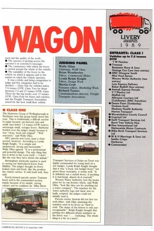
It was a tricky and tiring competition to judge and five categories had to be decided — Class One for vehicles below 7.5 tonnes GVW; Class Two for those between 7.5 and 17 tonnes GVW; Class Three for the big trucks over 17 tonnes GVW, Class Four for buses and coaches, and the Freight Transport Association award for the best small fleet vehicle.
• CLASS ONE
The Harborne Group of Wellingborough in Northants won this group hands down this year. This is traditionally a difficult section to judge because car-derived vans and small vans below 7.5 tonnes GVW tend to encourage small, scrappy livery. Harborne bowled over the judges simply because it was "clean, fresh and original". "Well executed," said Wally Olins.
NFC parcels arm Lynx came a close second, however. According to Lynda Relph Knight, "it is simple and uncluttered, strong and memorable." Wally Olins agreed. "It is a professional and powerful design. The only thing that lets it down is the Lynx itself — I don't like the way they have drawn the animal."
Birmingham wholesale market is used to seeing our third-placed livery from Midfish. The judges thought its livery looked clean and fresh, like the produce the vehicle carries. It sold itself well, they said.
Newly-formed parcels carrier Transam fared well in the commended section, mainly because of its simple, strong colours and its confident air. Mike Birch Transport Services of Stoke-on-Trent was highly commended for trying hard on a low budget. Lynda Relph Knight thought that it was "a local, low budget livery" but given those restraints, it works well. "It is definitely not a stylish livery, if anything it is functional, almost do-it-yourself."
Wessex Water Authority won the booby prize for its van liveries which, said Wally Olins, "look like they are for anything but a water company". The typeface for the water authority logo and name was so badly scripted, the judges could not initially read it.
Parcels carrier Amtrak did not fare too well either, with Olins slamming the typeface used in its livery as "hard to read. The shape of the letters is only just recognisable". Relph Knight thought that putting two different phone numbers on the livery was ". . . confusing. The whole thing is a bit of a mess".
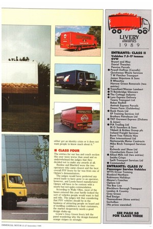
• CLASS TWO
The eggs on the side of Deans Farm's trucks from Aylesbury in Buckinghamshire were so well liveried that they looked good enough to eat, said the judges awarding this clever vinyl transfer first place in Class Two.
The panel of judges, especially the FTA's Richard Turner, were impressed by the way in which Deans Farm had entered a vehicle with difficult-to-livery areas, such as a rear tail-lift, with such success. The Deans Farm vehicle in Class One also drew praise.
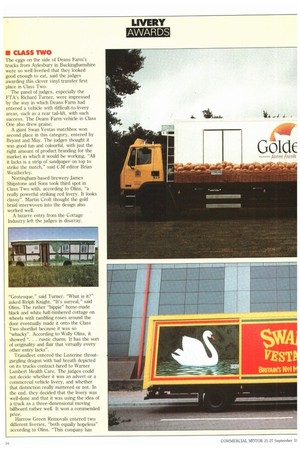
A giant Swan Vestas matchbox won second place in this category, entered by Bryant and May. The judges thought it was good fun and colourful, with just the right amount of product branding for the market in which it would be working. "All it lacks is a strip of sandpaper on top to strike the match," said CM editor Brian Weatherley.
Nottingham-based brewery James Shipstone and Sons took third spot in Class Two with, according to Olins, "a really powerful striking red livery. It looks classy". Martin Croft thought the gold braid interwoven into the design also worked well.
A bizarre entry from the Cottage Industry left the judges in disarray.
"Grotesque," said Turner. "What is it?" asked Relph Knight. "It's surreal," said Olins. The rather "hippie" home-made black and white half-timbered cottage on wheels with rambling roses around the door eventually made it onto the Class Two shortlist because it was so "whacky". According to Wally Olins, it showed ". . . rustic charm. It has the sort of originality and flair that virtually every other entry lacks".
Transfleet entered the Listerine throatgargling dragon with bad breath depicted on its trucks contract-hired to Warner Lambert Health Care. The judges could not decide whether it was an advert or a commercial vehicle livery, and whether that distinction really mattered or not. In the end, they decided that the livery was well-done and that it was using the idea of a truck as a three-dimensional moving billboard rather well. It won a commended prize.
Harrow Green Removals entered two different liveries, "both equally hopeless" according to Olins. "This company has either got an identity crisis or it does not want people to know much about it."
• CLASS FOUR
The entries for our bus and coach section this year were worse than usual and so underwhelmed the judges that they decided not to make any awards at all.
Beeline and Bluebird were the two operators who came closest and the best overall PSV livery by far was from one of Optare's demonstrators.
The judges would have preferred any award made to have gone to an operator, however, and Leeds-based manufacturer Optare will have to be content with a nearly-but-not-quite-commendation.
According to Wally Olins, most of the buses entered this year hardly looked the sort of vehicles people would want to hail and ride. The judges felt that considering that PSV vehicles should be in the business of attracting people on board and of instilling confidence in their customers, the market desperately needs a good design shake-up.
Cowie's Grey Green livery left the panel wondering why the design featured orange stripes so strongly.