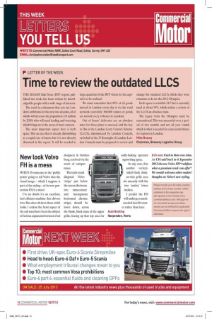
New look Volvo FH is a mess WHEN IS someone
Page 11

If you've noticed an error in this article please click here to report it so we can fix it.
in the 'public prints' going to tell Volvo that the visual image — which I suppose is part of the styling — of its new generation FH is a mess?
I've no doubt it's an excellent, fuel-efficient machine that drivers love. But, dear oh dear, those awful looks. I reckon the front aspect of the cab must have been the subject of furious arguments between rival designers in Gothenburg, resolved via the worst of compromises.
The trade-mark diagonal Volvo 'stripe' just below the screen (between two unnecessary and incongruous horizontal chrome strips) should be lower down, across the blank, black mass of the upper grille, freeing up that top area for sadly-lacking operator signwriting space.
In any case, that sombre verticalsided black chicken-wire grille area sits uneasily with the two `smiley' lower intakes.
I predict the FH will undergo a much needed facelift sooner rather than later. Alan Bunting Harpenden, Herts Ed's note: Each to their own Alan. As CM said back in 6 September 2012 the new Volvo FH "redefines what a premium truck can offer". We would welcome other readers' thoughts on Volvo's new styling.


