 1
1 2
2 3
3 4
4 5
5 6
6 7
7 8
8 9
9 10
10 11
11 12
12 13
13 14
14 15
15 16
16 17
17 18
18 19
19 20
20 21
21 22
22 23
23 24
24 25
25 26
26 27
27 28
28 29
29 30
30 31
31 32
32 33
33 34
34 35
35 36
36 37
37 38
38 39
39 40
40 41
41 42
42 43
43 44
44 45
45 46
46 47
47 48
48 49
49 50
50 51
51 52
52 53
53 54
54 55
55 56
56 57
57 58
58 59
59 60
60 61
61 62
62 63
63 64
64 65
65 66
66 67
67 68
68 69
69 70
70 71
71 72
72 73
73 74
74 75
75 76
76 77
77 78
78 79
79 80
80 81
81 82
82 83
83 84
84 85
85 86
86 87
87 88
88 89
89 90
90 91
91 92
92 93
93 94
94 95
95 96
96 97
97 98
98 99
99 100
100 101
101 102
102 103
103 104
104 105
105 106
106 107
107 108
108 109
109 110
110 111
111 112
112 113
113 114
114 115
115 116
116 117
117 118
118 119
119 120
120 121
121 122
122 123
123 124
124 125
125 126
126 127
127 128
128 129
129 130
130 131
131 132
132 133
133 134
134 135
135 136
136 137
137 138
138 139
139 140
140 141
141 142
142 143
143 144
144 145
145 146
146 147
147 148
148 149
149 150
150 151
151 152
152 153
153 154
154 155
155 156
156 157
157 158
158 159
159 160
160 161
161 162
162 163
163 164
164 165
165 166
166 167
167 168
168 169
169 170
170 171
171 172
172 GAS GLOWS ON
Page 56
Page 58
If you've noticed an error in this article please click here to report it so we can fix it.
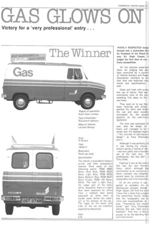
Victory for a 'very professional' entry . . .
HIGHLY RESPECTED desigr formed into a committee chai by President of the Royal A( emy Sir Hugh Casson, h judged the first class of our r livery competition.
All the schemes presented them for judging had alre. been examined by a commil of Vehicle Builders and Repaii Association members to ens that they met technical requ ments and specifications, . cost.
Clean and fresh with sympi etic use of colour—that was unanimous view of the jury awarding first place to the I van livery.
They went on to say that clean lettering and stripes spected the form and detail the van and were excel ler contrasted by the second graphics on the roof-moun signboard.
The view was expressed, ht ever, that the design of livery just managed to be 1. torian over the deadpan logo t} —"the triumph of technique o design", as Tony Charleswo put it.
Although it was perfectly clE it was boring—the choice colours giving a feeling of the —was very good, and a consider use of the roof area. "Vi professional, but foo safe", s Tony Gibb.
Fighting it out at the end w Gas was the new Homewi livery, which, although higl commended as an expression o clever concept, was relegated second place by criticisms of typography and final execution Of all the entries it was garded as probably the m. adventurous concept, though Hugh Casson did find the syml "more like a dove than a pigeor The committee found, howev that the typography was bc naive and unsympathetic to area. "Interesting, but unprof sional" said Tony Charleswot whereas Gas was "dull but pi fessional". And this, in the er proved to be the deciding fact Also regarded as highly r fessional was another well-knc corporate identity — Dunlop — though it did not relate as wel the van area as Gas did, the it lettering losing sympathy with red flash on the back and one the sides.
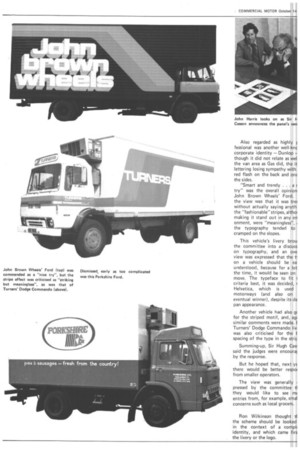
"Smart and trendy . . . a r try" was the overall opinion John Brown Wheels' Ford. the view was that it was trer without actually saying anythl the "fashionable" stripes, althoi making it stand out in any en onment, were "meaningless", the typography tended to cramped on the slopes.
This vehicle's livery brou the committee into a discuss on typography, and an ove view was expressed that the t on a vehicle should be ea understood, because for a lot the time, it would be seen on move. The typeface to fit 1 criteria best, it was decided, Helvetica, which is used motorways (and also on eventual winner), despite its de pan appearance.
Another vehicle had also gc for the striped motif, and, ag similar comments were made. Turners' Dodge Commando liv was also criticised for the I spacing of the type in the strip Summing-up, Sir Hugh Cas said the judges were encouraf, by the response.
But he hoped that, next ye there would be better respoi from smaller operators.
The view was generally I pressed by the committee ti they would like to see mc entries from, for example, smal concerns such as local grocers.
Ron Wilkinson thought ti the scheme should be looked in the context of a compli identity, and which came firs the livery or the logo.