


Making design pay in public transport
Page 32
If you've noticed an error in this article please click here to report it so we can fix it.
One-day Glasgow symposium organized by the Design Council Reported by Martin Hayes
AT FIRST sight the implementation of British Airways' massive corporate identity programme has little relevance to the small passenger vehicle operator. But in fact this subject together with others described at a seminar organized last week in • Glasgow by the Design Council have important lessons for anybody involved in carrying the public.
The principle behind the El/3m BA programme — started after the merger of BEA and BOAC — is based on a triangle of image, identity and personality. This was described by Mr Ronald Ganderton, BA's advertising controller. He stressed the necessity of the personal touch even when large numbers of people were being handled. When designing their programme the airline had appreciated that its own staff involvement was also highly important.
The final choice of a visual identity programme was influenced by the feeling of the staff. This programme had been selected after considerable research — clearly important when the cost of repainting a Jumbo Jet was more than £12,000.
The programme itself had three elements — a unique logotype, new house colours and a flight symbol. The same livery of course was used for all functions from aircraft to stationery.
Mr Ganderton said that the identity policy had to be both credible and relevant to the product, a theme which was echoed by Mr Ronald Whitehouse, the National Bus Company's public relations officer. He outlined the steps which had resulted in the adoption of NBC's new livery and design programme. The now famous "shadowed N" symbol had proved both distinctive and therefore very successful.
The choice of white as a colour for the 2,000-vehicle National Travel coach fleet had also proved effective and early criticisms of the probable effects of dirt seemed to have been unwarranted. He said that it cost about £150 to repaint each vehicle.
Common approach
The company had issued a corporate identity manual with loose-leaf pages to all branches and this was regularly updated when minor modifications were made. The same .sort of design approach had been applied to lettering both on and. off vehicles and on stationery and now a new design of bus stop to replace the company's estimated 100,000 bus stops had been designed.
The company had also used television advertising in an effort to boost the image of the bus and therefore of NBC too. The key to success in any such programme was co-ordination and consistency.
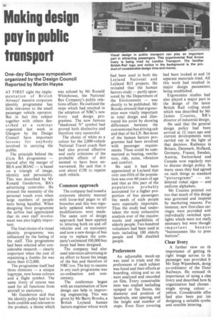
The conference began with an examination of how design can help in improving engineering. This was given by Mr Barry Brooks, a British Leyland human factors engineer whose work had been used in both the Leyland National and Leyland B15 projects. He revealed that the human factors study — partly sponsored by the Department of the Environment — was shortly to be published. Mr Brooks stressed that ergonomics were vitally important in total design and Mugtrated his point by showing differences between the conventional bus driving cab and that of the LN. But most of the human factors programme had been involved with passenger requirements. These could be summarized as heating, ventilation, ride, noise, vibration and comfort.
He said it had been appreciated at Leyland that over one-fifth of the population was over 60 years of age and that as this part of the population probably accounted for a higher proportion of bus passengers the needs of such people were especially important. Thus the study had undertaken the most exhaustive analysis ever of the requirements and capabilities of elderly people. Two hundred volunteers had been used in tests including 100 elderly people and 100 disabled people.
Preferences
An adjustable mock-up was used in trials and the preferences of each subject was listed and their efforts at boarding, sitting and so on were analysed and recorded on film. Every conceivable item was studied including ramped or flat floors, the diameter and position of handrails, seat spacing, and the height and number of steps. Even floor covering had been looked at and 14 separate materials tried. All this work had resulted in major design parameters being established.
Ergonomics studies had also played a major part in the design of the latest British Rail rolling stock which was described by Mr James Cousins, BR's director of industrial design.
He said that the general design policy had been arrived at 12 years ago and current developments were carried out in the light of that decision. Railways in Britain, Denmark, Holland, Germany, France, Sweden, Austria, Switzerland and Canada now regularly met to discuss design policy. In many cases they had agreed on such things as standard "picturegrams" unlettered visual signs — and uniform alphabets.
Mr Cousins pointed out too that much of this design was governed and inspired by marketing reasons. For instance, new first-class carriages were provided witt individually switched spot. lights which were not reall3 necessary but were though' important becaus( "businessmen like to pres! buttons".
Clear livery
A further view on th. importance of getting th right image across to th. passenger was provided b: Mr Siep Wijsenbeek, desigi co-ordinator of the Dutcl Railways. He stressed th importance of using a clea livery and described how hi organization had chosen . single strong colour – yellow. Considerable effor had also been put int, designing a suitable symbc and sensible lettering.