 1
1 2
2 3
3 4
4 5
5 6
6 7
7 8
8 9
9 10
10 11
11 12
12 13
13 14
14 15
15 16
16 17
17 18
18 19
19 20
20 21
21 22
22 23
23 24
24 25
25 26
26 27
27 28
28 29
29 30
30 31
31 32
32 33
33 34
34 35
35 36
36 37
37 38
38 39
39 40
40 41
41 42
42 43
43 44
44 45
45 46
46 47
47 48
48 49
49 50
50 51
51 52
52 53
53 54
54 55
55 56
56 57
57 58
58 59
59 60
60 61
61 62
62 63
63 64
64 65
65 66
66 67
67 68
68 69
69 70
70 71
71 72
72 73
73 74
74 75
75 76
76 77
77 78
78 79
79 80
80 81
81 82
82 83
83 84
84 85
85 86
86 87
87 88
88 89
89 90
90 91
91 92
92 93
93 94
94 95
95 96
96 97
97 98
98 99
99 100
100 101
101 102
102 103
103 104
104 105
105 106
106 107
107 108
108 109
109 110
110 111
111 112
112 113
113 114
114 115
115 116
116 117
117 118
118 119
119 120
120 121
121 122
122 123
123 124
124 125
125 126
126 127
127 128
128 129
129 130
130 131
131 132
132 133
133 134
134 135
135 136
136 137
137 138
138 139
139 140
140 Vehicle livery should put across the company's message. Some current
Page 76
Page 77
Page 78
If you've noticed an error in this article please click here to report it so we can fix it.
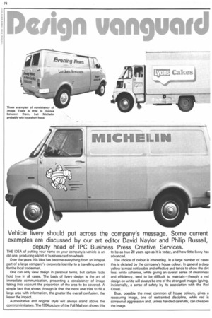
examples are discussed by our art editor David Naylor and Philip Russell, deputy head of IPC Business Press Creative Services.
THE IDEA of putting your name on your company's vehicle is an old one, producing a kind of business card on wheels. Over the years this idea has become everything from an integral part of a large company's corporate identity to a travelling advert for the local tradesman.
One can only view design in personal terms, but certain facts hold true in all cases. The basis of livery design is the art of immediate communication, presenting a consistency of image taking into account the proportion of the area to be covered. A simple fact that shows through is that the more one tries to fill a large area with information, the greater the overall confusion, the lesser the impact.
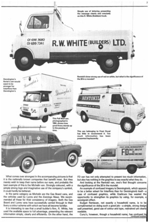
Authoritative and original style will always stand above the common imitators. The 1954 picture of the Pall Mall van shows this to be as true 20 years ago as it is today, and how little livery has advanced.
The choice of colour is interesting. In a large number of cases this is dictated by the company's house colour. In general a deep yellow is most noticeable and effective and tends to show the dirt less: white schemes, while giving an overall sense of cleanliness and efficiency, tend to be difficult to maintain—though a red design on white will always be one of the strongest images (giving, incidentally, a sense of safety by its association with the Red Cross). Blue, possibly the most common of house colours, gives a reassuring image, one of restrainted discipline, while red is somewhat aggresssive and, unless handled carefully, can cheapen the image.
What comes over strongest in the accompanying pictures is that it is the nationally known companies that benefit most. But they merely wish to keep their name before our eyes, and probably the best example of this is the Michelin van. Strongly coloured, with a simple strong logo and imaginative use of the company's symbol, it could hardly be bettered.
In the same category as Michelin are the Gas Board vans, and the vehicles used by Lyons and the Evenings News. We recommended all these for their consistency of imagery. Both the Gas Board and Lyons vans have successfully carried through to their livery a colour scheme with which we have all become familiar.
It is interesting to see that a small builder's firm, R. White, has used the available space to full advantage, presenting the relevant information simply, clearly and efficiently. On the other hand, the FD van has not only attempted to present too much information, but also has nothing in the graphics to say exactly vvhat they do.
And looking at the Rentokil van, one's first '!fiought concerns the significance of the 30 in the roundel.
An example of confused imagery is Dennington's, which appears to be a better advert for Interflora than for Dennington's itself —a case of confused graphics, while Eradicure has wasted the opportunity to strengthen its graphics by using, for example, a woodgrain effect.
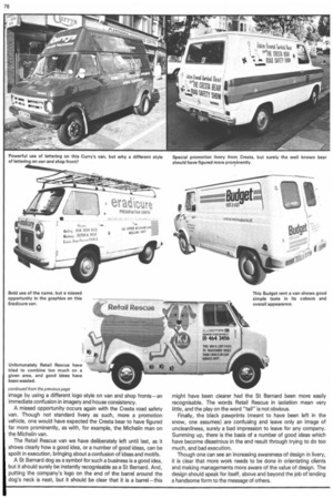
Budget Rentavan, not exactly a household name, is to be complimented on doing such a good job—a simple, strong design well presented, good use of colour and type, restrained yet clearly readable.
Curry's, however, though a household name1, has confused its image by using a different logo style on van and shop fronts—an immediate confusion in imagery and house consistency.
A missed opportunity occurs again with the Cresta road safety
• van. Though not standard livery as such, more a promotion vehicle, one would have expected the Cresta bear to have figured far more prominently, as with, for example, the Michelin man on the Michelin van.
The Retail Rescue van we have deliberately left until last, as it shows clearly how a good idea, or a number of good ideas, can be spoilt in execution, bringing about a confusion of ideas and motifs.
A St Bernard dog as a symbol for such a business is a good idea, but it should surely be instantly recognisable as a St Bernard. And, putting the company's logo on the end of the barrel around the dog's neck is neat, but it should be clear that it is a barrel—this might have been clearer had the St Bernard been more easily recognisable. The words Retail Rescue in isolation mean very little, and the play on the word "tail" is not obvious.
Finally, the black pawprints (meant to have been left in the snow, one assumes) are confusing and leave only an image of uncleanliness, surely a bad impression to leave for any company. Summing up, there is the basis of a number of good ideas which have become disastrous in the end result through trying to do too much, and bad execution.
Though one can see an increasing awareness of design in livery, it is clear that more work needs to be done in orientating clients and making managements more aware of the value of design. The design should speak for itself, above and beyond the job of lending a handsome form to the message of others.