11 The PSV class always seems to give our judges
Page 54

If you've noticed an error in this article please click here to report it so we can fix it.
a certain amount of trouble. With operators moving away from their staid corporation images of the sixties and seventies, there has been a marked increase in the use of bright colours and 'personality' liveries, especially in the post-deregulation era.
It is difficult to compare some of these brash new liveries with their more conservative or traditional counterparts, and subjective artistic judgements tend to rage long after the functional ones have been exhausted.
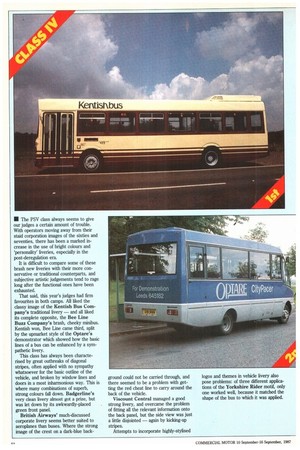
That said, this year's judges had firm favourites in both camps. All liked the classy image of the Kentish Bus Company's traditional livery — and all liked its complete opposite, the Bee Line Buzz Company's brash, cheeky minibus. Kentish won, Bee Line came third, split by the upmarket style of the Optare's demonstrator which showed how the basic lines of a bus can be enhanced by a sympathetic livery.
This class has always been characterised by great outbreaks of diagonal stripes, often applied with no sympathy whatsoever for the basic outline of the vehicle, and broken by window lines and doors in a most inharmonious way. This is where many combinations of superb, strong colours fall down. Badgerline's very clean livery almost got a prize, but was let down by its awkwardly-placed green front panel.
British Airways' much-discussed corporate livery seems better suited to aeroplanes than buses. Where the strong image of the crest on a dark-blue back ground could not be carried through, and there seemed to be a problem with getting the red cheat line to carry around the back of the vehicle.
Viscount Central managed a good strong livery, and overcame the problem of fitting all the relevant information onto the back panel, but the side view was just a little disjointed — again by kicking-up stripes.
Attempts to incorporate highly-stylised logos and themes in vehicle livery also pose problems: of three different applications of the Yorkshire Rider motif, only one worked well, because it matched the shape of the bus to which it was applied.


