


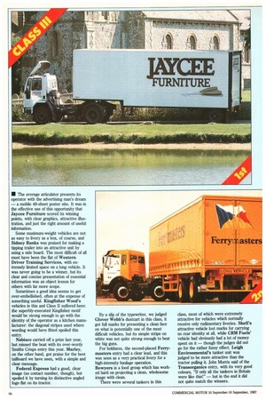
• The average articulator presents its operator with the advertising
Page 52
Page 53
If you've noticed an error in this article please click here to report it so we can fix it.
man's dream — a mobile 48-sheet poster site. It was in the effective use of this opportunity that Jaycee Furniture scored its winning points, with clear graphics, attractive illustration, and just the right amount of useful information.
Some maximum-weight vehicles are not as easy to livery as a box, of course, and Sidney Banks was praised for making a tipping trailer into an attractive unit by using a side board. The most difficult of all must have been the flat of Western Driver Training Services, with extremely limited space on a long vehicle. It was never going to be a winner, but its clear and concise presentation of essential information was an object lesson for others with far more scope.
Sometimes a good idea seems to get over-embellished, often at the expense of something useful. Kingfisher Wood's vehicles in this and Class II suffered here: the superbly-executed Kingfisher motif would be strong enough to go with the identity of the operator as a kitchen manufacturer: the diagonal stripes used where wording would have fitted spoiled this entry.
Nabisco carried off a prize last year, but missed the boat with its over-wordy Smiths Crisps entry this year. Marley, on the other hand, got praise for the best tailboard we have seen, with a simple and clear message.
Federal Express had a good, clear image (no contact number, though), but spoiled it by turning its distinctive angled logo flat on its tractor. By a slip of the typewriter, we judged Glover Webb's dustcart in this class, it got full marks for presenting a clean face on what is potentially one of the most difficult vehicles, but its simple stripe on white was not quite strong enough to beat the big guns.
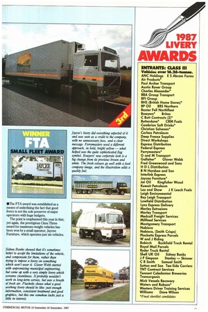
For boldness, the second-placed Ferrymasters entry had a clear lead, and this was seen as a very practical livery for a high-intensity haulage operation.
Bowyers is a food group which has worked hard on projecting a clean, wholesome image with clean.
There were several tankers in this
class, most of which were extremely attractive for vehicles which normally receive only rudimentary liveries. Shell's attractive vehicle lost marks for carrying no rear identity at all, while CRM Fuels' vehicle had obviously had a lot of money spent on it — though the judges did not go for the rather fussy effect. Leigh Environmental's tanker unit was judged to be more attractive than the tractor pulling it. John Morris said of the Transorganics entry, with its very good colours, "If only all the tankers in Britain were like this!" — but in the end it did not quite match the winners. • The FTA award was established as a means of underlining the fact that good livery is not the sole preserve of major operators with huge budgets.
The point is emphasised this year in that, yet again, the prestigious Class Three award for maximum-weight vehicles has been won by a small operator, Jaycee Furniture, which operates just six vehicles.
Sidney Banks showed that it's sometimes better to accept the limitations of the vehicle, and compensate for them, rather than trying to impose a livery on something which won't wear it. Glover Webb started with unpromising municipal engineering, but came up with a very simple livery which screams cleanliness. It probably wouldn't work in long-term service, but was a breath of fresh air. Placketts shows what a good working livery should be like: just enough information, consistent treatment and good graphics, but this one somehow lacks just a little in interest. Jaycee's livery did everything expected of it and was seen as a credit to the company, with no unnecessary fuss, and a clear message. Ferryrnasters used a different approach, in bold, bright yellow — what helped was the quite sophisticated flag symbol. Bowyers' new corporate look is a big change from its previous brown and white. The fresh colours go well with a food company image, and the illustration adds a quality ,feel.