 1
1 2
2 3
3 4
4 5
5 6
6 7
7 8
8 9
9 10
10 11
11 12
12 13
13 14
14 15
15 16
16 17
17 18
18 19
19 20
20 21
21 22
22 23
23 24
24 25
25 26
26 27
27 28
28 29
29 30
30 31
31 32
32 33
33 34
34 35
35 36
36 37
37 38
38 39
39 40
40 41
41 42
42 43
43 44
44 45
45 46
46 47
47 48
48 49
49 50
50 51
51 52
52 53
53 54
54 55
55 56
56 57
57 58
58 59
59 60
60 61
61 62
62 63
63 64
64 65
65 66
66 67
67 68
68 69
69 70
70 71
71 72
72 73
73 74
74 75
75 76
76 77
77 78
78 79
79 80
80 81
81 82
82 83
83 84
84 85
85 86
86 87
87 88
88 89
89 90
90 91
91 92
92 93
93 94
94 95
95 96
96 97
97 98
98 99
99 100
100 101
101 102
102 103
103 104
104 105
105 106
106 107
107 108
108 109
109 110
110 111
111 112
112 113
113 114
114 115
115 116
116 117
117 118
118 119
119 120
120 121
121 122
122 123
123 124
124 125
125 126
126 127
127 128
128 129
129 130
130 131
131 132
132 133
133 134
134 135
135 136
136 137
137 138
138 139
139 140
140 141
141 142
142 143
143 144
144 145
145 146
146 147
147 148
148 149
149 150
150 Good TIR liveries are good for Britain
Page 56
Page 57
Page 58
If you've noticed an error in this article please click here to report it so we can fix it.
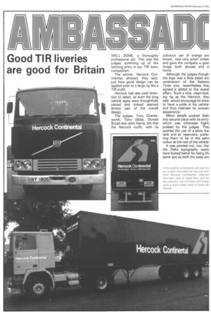
WELL DONE, a thoroughly professional job. This was the judges' summing up of the winning entry in our TIR livery competition.
The winner, Hercock Continental, showed, they said, just how good design can be applied even to a large rig like a TIR outfit.
Hercock had also paid attention to detail, as even the long vehicle signs were thoughtfully placed and indeed seemed almost part of the overall design.
The judges, Tony Charlesworth, Tony Gibbs, Donald Broad and John Harris, felt that the Hercock outfit, with its
judicious use of orange an brown, was very smart indeec and gave the company a gooc image both abroad and a. home.
Although the judges though. the logo was a little dated anc reminiscent of the Nationa Tyres one, nevertheless the agreed it added to the overal effect. Such a nice, clean-look. ing rig as the Hercock, the said, would encourage its drivel to have a pride in his vehicle and thus maintain its outwarc appearance.
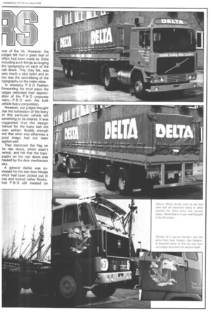
Minor details pushed Delta into second place with its entry which was otherwise highl} praised by the judges. The queried the use of a silver fue tank and air reservoirs, prefer. ring them to be in the samE colour as the rest of the vehicle
It was pointed out, too, thathe Delta typography woulc have looked better for being thE same size as both the sides anc
rear of the tilt However, the judges felt that a great deal of effort had been made by Delta including such things as ranging the typography on each of the cab doors. This, they felt, was very much a plus point and so too was the centralising of the typography on the trailer sides.
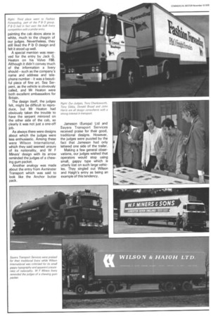
In choosing P Et 0 Fashion Forwarding for third place the udges reiterated their appreci3tion of the P Et 0 corporate ivery—P a0 won the bulk rehicle livery competition.
However, our judges thought :hat the translation of the livery NI this particular vehicle left ;omething to be desired. It was iuggested that the design rianual for the livery had not )een written flexibly enough )nd that what was otherwise a lood image had not been ipplied well.
They instanced the flag on he rear doors, which wasn't :entral, and felt that the typoiraphy on the rear doors was nasked by the door mechanism )ars.
A general dislike was exgessed for the rear door hinges vhich had been picked out in ilue and looked rather finicky. knd P & 0 still insisted on
Right: Third place went to Fashion Forwarding, part of the P & 0 group. P Et 0 had in fact won the bulk livery competition with a similar entry.
painting the cab doors alone in white, much to the chagrin of our judges. Nevertheless, they still liked the P Et 0 design and felt it stood up well.
A special mention was reserved for the entry by Jack G. Heaton on his Volvo F88. Although it didn't convey much of the information a livery should—such as the company's name and address and telephone number—it was a beautiful piece of fine art. Sea Serpent, as the vehicle is obviously called, and Mr Heaton were both excellent ambassadors for Britain.
The design itself, the judges felt, might be difficult to reproduce, but Mr Heaton had obviously taken the trouble to have the serpent mirrored on the other side of the cab, so clearly it was not just a one-off job.
As always there were designs about which the judges were less enthusiastic. Among these were Wilson International, which they said seemed unsure of its nationality, and W F Miners' design with its arrow reminded the judges of a chewing gum packet.
Another analogy was made about the entry from Axminster Transport which was said to look like the Anchor butter pack. Jameson (Europa) Ltd and Sayers Transport Services received praise for their good, traditional designs. However, the judges were puzzled by the fact that Jameson had only lettered one side of the trailer.
Making a few general observations, our judges wished that operators would stop using small, gappy type which is utterly lost on such large vehicles. They singled out Wilson and Haigh's entry as being an example of this tendency.