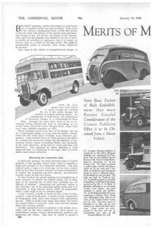
MERITS OF M 3ILE PUBLICITY
Page 50
Page 51
Page 52
Page 53
Page 54
If you've noticed an error in this article please click here to report it so we can fix it.
which the body panels have been turned to good account for catching the eye of the public through the medium of tasteful lettering display, the colourful use of trade marks, the employment of decorative designs or a combination of these ideas. Amongst van users there seems to be an increasing leaning towards this form of advertising, as was clearly borne out at the recent Olympia Show, where there were some splendid examples on view.
Where extensive panel areas have to be treated, the use of a well-founded design in strong, but not garish, colours, which fills the whole space available, is an attractive proposition. Such schemes often owe their success to the choice of a simple and uncrowded design and the selection of harmonious colours, smart contrasting shades, not necessarily of the same derivative, being used to create smartness and distinction. This question of colour blending is most important and, in considering it, the right value of certain shades must receive attention.
Simulating the Commodity Sold.
A third and, perhaps, the most attractive form of mobile publicity is the specially shaped body, built to resemble a large-scale example of the commodity marketed. This idea enjoyed quite a vogue a few years ago, but its cost, coupled with the fact that increased taxation has made it imperative to employ the maximum pay-load capacity, has probably brought about its fall from grace.
It often involves the special shaping and strengthening of body members to achieve the desired object, but in these days of the growing use of metal such problems are not difficult of solution. Aluminium has particular claims in this direction, one of its important merits being that it is obtainable in large flawless sheets, whilst its malleability offers a wide range of use for unusual shapes.
A loaf of bread, a bottle or barrel of beer, a tin of toffee, a pencil, a tube of tooth paste, a section of tyre, represented in Gargantuan form, have been adopted with outstanding success: There is much scope along these lines, but before the desired object is achieved, body costs and lost loading space may occasion anxiety.
Another specialized form of publicity is the mobile showroom, such as has been employed with much success by confectionery makers, tobacco manufacturers, milliners, gas companies and others. This class of vehicle is purely a
83.2
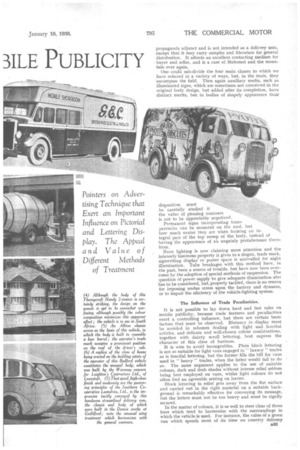
(4) Although the body of this Thorn ycroft Handy 2-tonner is certainly striking, the design on the panels is apt to be somewhat confusing, although possibly the colour composition minimizes this apparent effect ; the vehicle is in use in South Africa. (5) An Albion chassis serves as the basis of this vehicle, in which the body is built to resemble a beer barrel; the operator's trade mark occupies a prominent position on the roof of the driver's cab. (6) A replica of the class of house being erected on the building estate of the operator of this Bedford vehicle constitutes the anus-nal body, which was built by the Waveney concern for Leighton's Contractors Ltd., of Lowestoft. (7) That speed, high-class finish and modernity are the governing principles of the Southern Cooperative Laundries, Ltd., is the impression tacitly conveyed by this handsome streamlined delivery van, the chassis and body of which were built in the Dennis works at Guildford; note the unusual wing treatment which harmonizes with the general contours.
disposition must be carefully studied if the value of pleasing contours is not to be appreciably negatived.
Permanent signs incorporating transparencies can be mounted on the roof, but how much neater they are when forming an integral part of the top sweep of the body, instead of having the appearance of an ungainly protuberance therefrom.
Neon lighting is now claiming more attention and the intensely luminous property it gives to a slogan, trade mark, signwriting display or poster space is unrivalled for night illumination. Tube breakages with this method have, in the past, been a source of trouble, but have now been overcome by the adoption of special methods of suspension. The question of power supply to give adequate illumination also has to be considered, but, properly tackled, there is no reason for imposing undue stress upon the battery and dynamo, or to impair the efficiency of the vehicle-lighting system.
The Influence of Trade Peculiarities.
It is not possible to lay down bard and fast rules on mobile publicity, because trade features and peculiarities exert a controlling influence, but there are certain basic factors that must be observed. Blatancy in display must be avoided in schemes dealing with light and fanciful articles, and delicate and well-chosen colour combinations, together with dainty scroll lettering, best express the character of this class of business.•
It is wise to avoid incongruities. Plain block lettering is not so suitable for light vans engaged in "luxury " trades as is fanciful lettering, but the former fills the bill for vans used in " heavy " trades, when the latter would fail to do so. The same argument applies to the use of suitable colours, dark and drab shades without intense relief seldom being best employed on vans, whilst light colours do not often find an agreeable setting on lorries.
Block lettering in relief gets away from the flat surface and carried out in the right material on a suitable background is remarkably effective for conveying its message, hut the letters must not be too heavy and must be rigidly secured.
In the matter of colours, it is as well to steer clear of those hues which tend to harmonize with the surroundings in which the vehicle is used. For instance, the value of a green van which spends most of its time on country delivery service would be reduced by its merging with the natural colours of the countryside. . • On panels made up of two or more sheets, the half-round mouldings or flat metal strips that cover. the joins create difficulties, for the artist, if a design overlaps them, and in planning the scheme of decoration an effort Should be made to avoid the splitting up of any key feature. Many a body has had its value reduced by inattention to this factor.
In all vans but the smallest, mouldings are a source of trouble in plotting publicity designs, but since they are inevitable for various reasons, their location should be carefully studied. In some instances, it -will be found that vertical mouldings are preferable to those running longi 034 tudinally and they often "fit in " better with the scheme of decoration. Panel areas need not be made up of sections of equal size, and wording above and below a larger central section carrying a pictorial display would enable the mouldings to fulfil a definite purpose in the layout.
The use of a standardized finish for a fleet is of great advantage, because the psychological effect on the public results in the association of a specific company with a particular colour, although this is not often adequate in itself. some message or design being necessary to complete the publicity potential.
Then, the employment of some sort of trade symbol has the same effect, as in the case of a well-known brewery concern, the road motors of which all carry a red barrel in a prominent position. This is a simple idea of intrinsic worth.
Some vans carry mirrors upon which word.
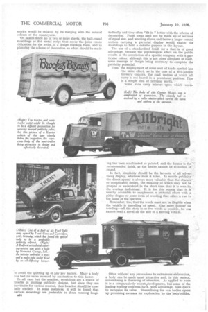
(Left) The body of this Garner 30-cwt. van is constructed of a'uminium. The shapely tail is enclosed by a roller shutter which carries the name and address of the operator.
ing has. been sandblasted or painted, and the former is the' recommended finish, as the letters cannot be scratched or erased.
In fact, simplicity should be the keynote of all display, whatever form it takes. In mobile publicity the direct appeal is always more valuable than the obscure or complicated design, the meaning of which may not be grasped or understood in the short time that it is seen by the a vetage individual. It is for this reason that it is usually advisable to supplement a pictorial effort with a pithy slogan or some form of wording that offers a cue to the name of the operator.
Remember, too, that the words must not be illegible when the vehicle is travelling at speed. One snore pointer on wording—tell the story in as few words as possible, for one cannot read a novel on the side of a moving vehicle.
Often without any pretensions to extraneous elaboration, a body can be made most attractive and, in this respect, streamlining is deserving of attention. As applied to vans it is a comparatively recent ,development, but some of the leading trading concerns have, with advantage, been quick to recognize its value. Streamlining for van bodies opens up promising avenues for exploration by the' bodybuilder,
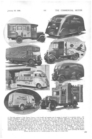
(r) The body treatment of this Conorter 2-tanner is both forceful and pleasing, and it 9 message is conveyed in no uncertain manner. (2) Dignified embellishment, coupled with attractive body contours, give this Guy 3-tan van a distinctive appearance; the body was built by A. Stenning and Co. (3) Sun-ray lines in conjunction with a central oval panel carrying the name, address and business of the operator, lend a note of individuality to this large-capacity Leyland van. (4) There is a futuristic note about the treatment of the panelling on this Dennis van which, through bold design, draws attention to a greyhound stadium. (5) That it is not always necessary to have spacious panels for obtaining good publicity is clearly borne out by this launderer 's Albion lorry; the special frontal treatment is most pleasing to the eye. The body was designed by Holland Coachcraft, Ltd., of Glasgow, and built by Henry Alexander, Ltd., of Edinburgh. (6) Good balance characterizes the lines of this Commer laundry van, which has a body by J. H. Jennings and Son, Ltd, of Sandbacb, (7) There is a distinct atmosphere of "class" about this laundry van body by W. Harold Perry Ltd., on a Fordson chassis.. A figure display and -neat leltring combine to tell the story. The back panelling is also used to advantage. (8) The name of the concern operniing.thi! Redford 30-cwt. van has been used to a marked purpose in the design of a unique body.
but "it must be sensibly controlled and not stupidly exaggerated if the all-round efficiency of the normal delivery vehicle is not to be impaired.
Apart from the sides and back of a vehicle, the van body offers a further chance for publicity on the roof, where the use of a few well-chosen words will be certain to meet the eye of the traveller on the top deck of a bus or tram. In the case of .a lorry the roof of the driver's cab offers limited scope in this direction.
(Right) The body of this Bedford van embodies some good publicity ideas and was built by Clement, Butler and Cross, Ltd., of Brentford. The oval design above the driver's cab is edged with mirror-disc signs, whilst the oblong design on the side is a facsimile of the operator's well-known poster in green, blue and yellow. There are roller shutters at the sides and the rear, but these do not detract from the publicity merit of the vehicle.
Drapery establishments and publishing houses often use poster panels on their vans, and they are valuable where the " copy" is frequently changed.
The solus publicity site afforded by the motor vehicle can prove to be a vital sales force, but an understanding of advertising technique is essential to employ it to the best advantage. It is hoped that the points raised in this article will contribute to this end. One final thought —when you have carried out your publicity ideas do not let them be reduced in value by failing to keep the body in spick and span condition.


