 1
1 2
2 3
3 4
4 5
5 6
6 7
7 8
8 9
9 10
10 11
11 12
12 13
13 14
14 15
15 16
16 17
17 18
18 19
19 20
20 21
21 22
22 23
23 24
24 25
25 26
26 27
27 28
28 29
29 30
30 31
31 32
32 33
33 34
34 35
35 36
36 37
37 38
38 39
39 40
40 41
41 42
42 43
43 44
44 45
45 46
46 47
47 48
48 49
49 50
50 51
51 52
52 53
53 54
54 55
55 56
56 57
57 58
58 59
59 60
60 61
61 62
62 63
63 64
64 65
65 66
66 67
67 68
68 69
69 70
70 71
71 72
72 73
73 74
74 75
75 76
76 77
77 78
78 79
79 80
80 81
81 82
82 83
83 84
84 85
85 86
86 87
87 88
88 89
89 90
90 91
91 92
92 93
93 94
94 95
95 96
96 97
97 98
98 99
99 100
100 101
101 102
102 103
103 104
104 105
105 106
106 107
107 108
108 109
109 110
110 111
111 112
112 113
113 114
114 115
115 116
116 117
117 118
118 119
119 120
120 121
121 122
122 123
123 124
124 125
125 126
126 127
127 128
128 129
129 130
130 131
131 132
132 133
133 134
134 135
135 136
136 137
137 138
138 139
139 140
140 141
141 142
142 143
143 144
144 145
145 146
146 147
147 148
148 149
149 150
150 151
151 152
152 Sizing up bulk livery
Page 80
Page 81
Page 82
If you've noticed an error in this article please click here to report it so we can fix it.
THE PRIDE which operators have in their vehicles is reflected in the way they turn them out. This is particularly true of bulk operators, who spend a lot of time and money in achieving a livery and appearance which will do them credit.
The third of our livery competitions, this time for bulk vehicles, has, we hope, further encouraged this spirit.
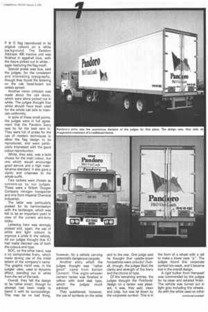
Although they were impressed with the high standard of all the entries in the CM bulk vehicle section, the judges had no hesitation in awarding first place to Pandoro, the road freight transport company of the P 80 Group.
This entry, they felt, was an imaginative treatment of a traditional theme, with the
P Er 0 flag reproduced in its original colours on a white background. The Seddon Atkinson 400 tractive unit was finished in eggshell blue, with the doors picked out in white— again featuring the flag motif.
Special praise was due, said the judges, for the consistent and interesting typography, though they found the lettering on the cab head-board too widely spread.
Another minor criticism was made about the cab doors,
which were alone picked out in white. The judges thought that white should have been used for the whole cab side to maintain uniformity.
In spite of these small points, the judges were in full agree ment that the Pandoro livery was by far the best sent in. They were full of praise for the use of modern techniques to allow the flag design to be reproduced, and were particularly impressed with the good colour reproduction.
White, they said, was a bold choice for the main colour, but one which would encourage good service and a high maintenance standard. It also gave a clarity and crispness to the whole outfit.
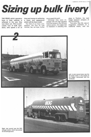
Two tankers were chosen as runners-up by our judges.
These were a British Oxygen Company nitrogen transporter and one from Imperial Chemical Industries.
The latter was particularly praised for its harmonisation with the landscape, which was felt to be an important point in view of the current anti-lorry lobby.
Lettering here was strongly praised and, again, the use of white and light colours to improve a pride in the vehicle. All our judges thought that ICI had made discreet use of both the colours and type.
BOC, on the other hand, was a no compromise livery, which made strong use of the initial letters of the company's name. The graphic motif was, in the judges' view, used to dynamic effect, standing out in white from the red of the tank.
Overall, they felt the design to be rather smart, though no attempt had been made to blend it with its surroundings. This may be no bad thing, however, for a vehicle carrying potentially dangerous cargoes.
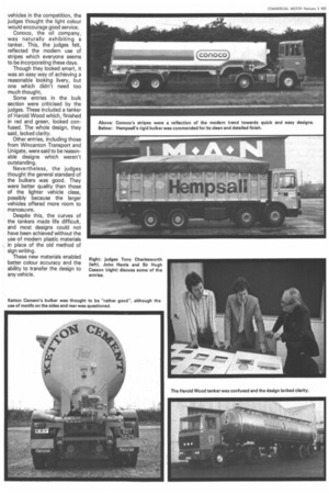
Another entry which the judges thought was "rather good" came from Ketton Cement. This eight-wheeler cement tanker was finished in yellow with bold slab type, which the judges much admired.
They questioned, however, the use of symbols on the sides and to the rear. One judge said he thought that upside-down horseshoes were unlucky! Overall, though, the judges liked the clarity and strength of the livery and the choice of type.
Of the remaining entries, the judges thought the Pickfords' design on a tanker was pleasant. It was, they said, clean and crisp, but was let down by the corporate symbol. This is in the form of a wheel with a tail to make a lower case "p". The judges found this corporate symbol too weak, and it became lost in the overall design.
A rigid bulker from Hempsall was commended by the judges for its clean and detailed finish. The vehicle was turned out in light grey including the wheels. As with the white used on other vehicles in the competition, the judges thought the light colour would encourage good service.
Conoco, the oil company, was naturally exhibiting a tanker. This, the judges felt, reflected the modern use of stripes which everyone seems to be incorporating these days.
Though they looked smart, it was an easy way of achieving a reasonable looking livery, but one which didn't need too much thought.
Some entries in the bulk section were criticised by the judges. These included a tanker of Harold Wood which, finished in red and green, looked confused. The whole design, they said, lacked clarity.
Other entries, including those from Wincanton Transport and Unigate, were said to be reasonable designs which weren't outstanding.
Nevertheless, the judges thought the general standard of the bulkers was good. They were better quality than those of the lighter vehicle class, possibly because the larger vehicles offered more room to manoeuvre.
Despite this, the curves of the tankers made life difficult, and most designs could not have been achieved without the use of modern plastic materials in place of the old method of sign writing.
These new materials enabled better colour accuracy and the ability to transfer the design to any vehicle.