


Irs can be beautiful
Page 57
Page 58
If you've noticed an error in this article please click here to report it so we can fix it.
AMEY Roadstone Corporation Limited has won CM'S first-ever livery competition for tipping vehicles. ARC submitted two entries, both articulated vehicles, and the judges were unable to separate them for first place.
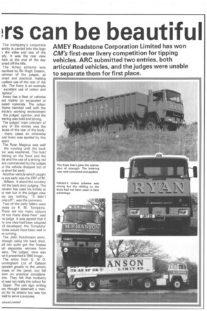
The company's corporate entity is carried into the logo 1 the sides and rear of the )dy. It was the rear view hich at the end of the day trried off the title.
The Amey scheme was scribed by Sir Hugh Casson, lairman of the judges, as ;mart and practical, making
ccellent use of the rear of the )dy. The livery is an example excellent use of colour and .aphics".
Amey has a fleet of vehicles ;ed mainly on excavated or sated materials. The colour :heme blended well with the hicle's working environment the judges' opinion, and the ttering was hold and strong.
The judges' main criticism of any of the entries was the isuse of the rear of the body. many cases an otherwise )od livery was spoiled by this ipect.
The Ryan Magirus was well the running until the back or was examined. The bold ttering on the front and the de and the use of a strong red ere commended by the judges .it the vehicle dropped out of le short list early.
Another vehicle which caught le eye early was the ER F of M.
. Wilson. It stood the scrutiny til the back door judging. The )erator has used his initials at le rear but in the judges view ley say nothing. "It didn't )me off", was the comment.
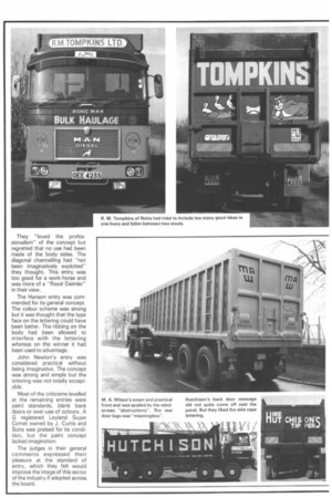
Two of the early fallers were itries by R. M. Tompkins.
There are too many colours ld too many ideas here" said le judge. It was agreed that if ly one idea had been adopted Id developed, the Tompkins' Itries would have been well in le running.
The John Hutchinson entry, though using the back door,
3d not quite got the finesse lat separates winners from sers. The judges' view was iat it presented a 1940 image.
The entry from G. Et D. unningham Ltd of Galston )pealed greatly to the artistic ?rises of the panel, but fell Dwn on practical consideraDns. They felt that mulberry
id was not really the colour for tipper. The cab sign writing ley thought deserved a menan for its artistry but was too -nail to serve a purpose.
They "loved the professionalism" of the concept but regretted that no use had been made of the body sides. The diagonal channelling had "not been imaginatively exploited" they thought. This entry was too good for a work-horse and was more of a "Royal Daimler" in their view.
The Hanson entry was commended for its general concept. The colour scheme was strong but it was thought that the type face on the lettering could have been better. The ribbing on the body had been allowed to interfere with the lettering whereas on the winner it had been used to advantage.
John Newton's entry was considered practical without being imaginative. The concept was strong and simple but the lettering was not totally acceptable.
Most of the criticisms levelled at the remaining entries were paint standards, blank back doors or over-use of colours. A G registered Leyland Super Comet owned by J. Curtis and Sons was praised for its condition, but the paint concept lacked imagination.
The judges in their general comments expressed their pleasure at the standard of entry, which they felt would improve the image of this sector of the industry if adopted across the board.