


A contract-hire view of publicity
Page 51
If you've noticed an error in this article please click here to report it so we can fix it.
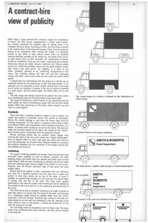
HOW does a large contract-hire company regard the importance of livery? The Blox Group, headquartered in south west London, has recently examined the publicity value of vehicle livery in its Transport Services News. According to Blox, the first thing to decide is the overall colour of the body and chassis. There are two particular factors to be considered when making the choice. It is generally unwise to use white or light colours unless there are excellent cleaning facilities available as dirt shows up, and looks much worse, on light colours than on dark. Secondly, the combination of colours should be considered. There are two types—advancing and receding. Advancing colours are bright colours--cadmium red, chrome yellow and so on—while the receding colours are the duller shades—black, dark brown and dark green. For legibility it is best to put either "receding" lettering on an "advancing" background or vice versa. Two receding colours will look dull and two advancing colours will clash, cancel each other out and make the overall effect garish.
It should also be remembered that the shape of a vehicle can be materially altered by the positioning of dark and light shades. If, for example, you are operating a short chubby vehicle then a low deep line of colour can lengthen it visually. If the top of a vehicle is painted in a dark colour, and the bottom light, the whole effect can be top heavy.
The cab, wings and chassis should all be painted the same colour but a contrasting colour for the body itself is well worth while.
The scope for lettering is rather limited on the articulated and flat truck bodies but there is tremendous scope with the box and tanker bodies. What then should go on the body, where should it go and how is it most legible?
Symbols
There has been a growing tendency simply to use a symbol, but unless this symbol is nationally known this cannot be advocated. Whom the vehicle belongs to and what the owner does must be instantly recognized. For this reason a company name alone is often not sufficient either and a description of the company's function, or a slogan, is usually worth putting on as well as the name. This does not mean that symbols should not be used—but except for the "giants" they are best used in conjunction with the operator's names.
Strong warnings should also be avoided. Heavy danger lines covering the back of the lorry and notices like "highly inflammable" have an adverse effect on other road users and could even result in your lorry being kept out of some sites. Diagonal stripes on a bumper are perfectly adequate but the remainder of the design should take this addition into account.
Lettering
The types of lettering available are various. There are both sent and sans-serif faces available as well as Roman (upright) and italic (sloping) letters and finally there are capitals and lower case (normal small letters). With the type of lettering no arbitrary rule can be made and each individual case must be judged on its merits. It is fair to say, however, that the Roman sans-serif type of face gives the most modern effect.
Words should be applied in lines--remember that your vehicle is only seen for a fleeting moment and one long line is easier and quicker to read than words one on top of the other. It must, if possible, be applied high enough up to be read over the top of traffic or parked cars and flat to the road. This latter point applied particularly in the case of a tanker where lettering must be applied to the outside of the curve and not on the upward or downward part of the curve.
Two final points only to consider. Lettering at an angle is harder to read than when it is square with the shape of the body, and lettering on a rectangular shape should be applied offset from the centre, otherwise it will look strange. Therefore sign writing on the side of a body should be to one side and preferably to the top, whereas at the back, which is more or less square, it should be centred but in line with the writing on the side.
As in all things there are exceptions, even to these rules. The basic sorts to be considered have been outlined—the final choice belongs to the operator.