


the Wide Sell the Paektge
Page 43
Page 42
Page 44

Page 45
If you've noticed an error in this article please click here to report it so we can fix it.
" AINTING, sir,". said Dr. Johnson, "can ilk's
trate, but cannot inform." . Whilst this may have
been true in 1-784, the promotion of comm.ercial art-to its present status has greatly vitiated the strength of his remark. For in the transport industry alone, the value of painting as a means for information and publicity cannot be over-estimated.
A well-presented vehicle, combining with its transport duties the function of bringing a product into the public consciousness, is as valuable asa squad of salesmen. Moreover, to be successful, a van used in this way needs the same qualities as a good salesman—integrity, personality and individuality. •
To achieve them is no easy task. Nevertheless, where they have been successfully obtained, the results can be estimated in terms of pounds, shillings and pence, and certainly justify the expense and difficulty entailed. Not all transport managers would agree with this view, but those serving progressive concerns can testify to the efficiency of an attractive fleet from the publicity impact that it produces.
Publicity on vehicles 'falls into three broad categories. The first is the pictorial type, in which a picture on a vehicle is relied upon to call a product to mind. Secondly, there is the symbolic class, into which fall vehicles which carry a well-known sign, long associated with the manufacturer's goods. Thirdly, there is the style best suited to distributors, in which the name of the concern alone is used, this being sufficiently well known to have the desired effect, This last approach depends entirely for its success on the appropriateness of the lettering used. Ai all three categories can be combined in one design, lettering is one of the most impOrtant features of any display. Many C-licence•holders make-the mistake of believing that any type of lettering will do for their vehicles, and entrust the painting of their names on the vehicles to any signwriter, without thought on the question. The outcome is often disastrous and confers an unwanted anonymity on the vehicles. Poor or ipapposite lettering is scarcely noticed by the passer-by.
a8
ore enlightened is the attitude of the concern whichlois a specialist designer to evolve a suitable style:
its vehicles • here this is connected with a house-style of packagand publicity, its effect is startling. The package nies .familiar to the public And the sight of the des similarly painted serves as a constant reminder
e product. • • the opinion of J. Wix and Sons, Ltd., manufacturer ensitas cigarettes, no more is needed on a vehicle a repr'esentation-of the type of package sold. To Ifective, however, the.. quality _of the reproduction' t,..ke 'high and arranged -sci as to have the maximum catching ability. To this end, the four vans used the concern .tO.1.distribUte its cigarettes from the
em for ing bec veh of
of tha be fliLt eye by
London factory are finished in a standard livery unusual for its plainn2ss.
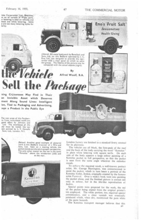
The vehicles are all black, the fore-peak of the roof and the back of the body carrying the word " Kensitas" in plain white lettering with square serifs. On each side of the body appears a large colour painting of a Kensitas packet in full perspective, so that the packet is seen from the same angle wherever the onlookei stands.
To achieve the required result, a well-known portrait artist, Mr. George Harrington, was commissioned to paint the packet, which in turn bears a portrait of the Kensitas butler, Jenkin, originally created by the famous artist Furnival. Over a week's work went into painting the packet alone, and the finished picture is correct not only in colour, but in the life-like reproduction of Jenkin.
Special paints were prepared for the work, the red of the packet being copied from the original printer's ink employed. The white portion, too, required special consideration, and a clear varnish was eventually produced which, when dry, maintained the pure white of the paint beneath.
The Kensitas transport manager believes that this B9 design reflects the quality of the product. The simple nature of the display is undoubtedly attractive and implies a well mannered appi oach to the buyer In the artist's opinion, the success of this vehicle depends on the fact that pictures speak all languages and, in this case, everything that needs to be said is said by the packet. "A well-turned-out van," says Mr. Harrington, who has painted such figures for many years, " is like a well-dressed salesman."
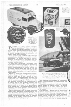
Rather different is the approach of T Wall and Son, Ltd. The whole policy of the concern on both packaging and vehicle appearance was recently reviewed. A world-renowned firm of industrial designers, Messrs. Raymond Loewy and Associates, were called in, and a new style of livery was developed for the Wall's fleet in which The best points of the old style were retained
and new ones introduced Formerly, vans used for sausage and cooked-meat distribution were painted in cream and beige, the ice-cream vans being light blue and cream. The new vans will all be identical. Cream and blue are now the fleet colours; lighter shades were previously used. To add the finishing touch, the Raymond Loewy designers produced a new symbol for the concern comprising a red W embracing the name "Walls."
Situated behind the cab and interrupting a curving red " cheat " line, the new symbol attracts much attention.'
Members of the London staff of Raymond Loewy believe that one motif should be employed by a concern in all its publicity matter, poster advertising, vehicles and even on shops and buildings. In this way, they say, .the product never escapes the consumer's mind. Colour and lettering are also vital, and both should be appropriate to the products concerned. Fussiness should be avoided, and the design should be simple. A clean livery emphasizes, too, the importance of hygienc—especially in food vans.
In the United States, much thought is devoted to such matters, the design and engineering departments of organizations like that founded by Raymond Loewy combining to evolve a complete vehicle which fits in as a consistent part of a publicity policy. Thus, a distinctive style can be associated with one enterprise, the bodyWork being arranged to fit any of a number of makes of chassis which the operator may require.
American experience of vehicle presentation must be respected, for no nation has so studied the science of marketing as have the Americans. Tradition is treated not as a model to be unfailingly copied, but as a guide to the lines upon which one should work. British operators can learn much from them, for only by retaining the good that is to be found in long-established methods of approaching the public and by modifying it to suit present-day cynicism about advertising. can sound designs be discovered.
Four examples pi outstanding work in this field. are frequently seen on British roads. One in
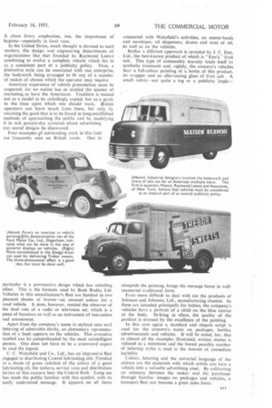
particular is a provocative design which has unfailing effect. This is the formula used by Bush Radio, Ltd. Vehicles in this manufacturer's fleet are finished in two pleasant shades of brown—an unusual colour for a road vehicle. It does, however, remind the observer of the dual role of a radio or television set, which is a piece of furniture as well as an instrument of instruction and amusement.
Apart from the company's name in stylized sans serif lettering of admirable clarity, an elementary representation of a bush appears on the vehicles. This evocative symbol can be comprehended by the most unintelligent person. One does not have to be a .crossword expert to read the legend,
C. C. Wakefield and Co., Ltd., has an impressive fleet engaged in distributing Castrol lubricating oils. Finished in a shade of green redolent of the colour of a good lubricating oil, the tankers, service vans and distribution lorries of this concern bear the Castroi flash. Long use has made the public familiar with this .symbol, with its • easily understood message. It appears on all items
connected with Wakefield's activities, on memo-heads and envelopes, oil dispensers, drums and cans of oil, ets well as on the vehicles.
Rather a different approach is revealed by J. C. Eno, Ltd., the best-known product of which is " Eno's " fruit salt. This type of commodity scarcely lends itself to symbolic treatment and, rightly, the concern's vehicles bear a full-colour painting of a bottle of this product, its wrapper and an effervescing glass of fruit salt. A small rubric--not quite a tag or a publicity jingle—
alongside the painting, brings the message home in wellmannered traditional form.
Even more difficult to deal with are the products of Johnson and Johnson, Ltd., manufacturing chemist. As these are intended principally for babies, the company's vehicles have a portrait of a child on the blue canvas of the body. Striking in effect, the quality of the product is stressed by the excellence of the painting.
In this case again a standard and elegant script is • used for the concern's name on packages, bottles, advertisements and vehicles. It will be noted, too, that in almost all the examples illustrated, written matter is reduced to a minimum and the fewest possible number of lettering styles is used in the interest of immediate legibility.
Colour, lettering and the universal language of the pfeture are the materials with which artists can turn a vehicle into a valuable advertising asset. By cultivating an intimacy between the maker and the purchaser through familiar images. on packages and vehicles, a transport fleet can become a great sales force.