


An immaculate drawbar
Page 46
If you've noticed an error in this article please click here to report it so we can fix it.
THE FIRST CM livery competition of 1982 was judged in two areas by our panel of three designers. Area one covered the West Country, Wales, areas of the South West and the West Midlands, and Area two included the Home Counties as far up as the East Midlands.
The overall standard of the livery was below par, according to the judges, but the winners were worthy of the CM Silver Salver award.
Livery should not only be aesthetically acceptable, in our judges' view, but should convey succinctly the business of the operator. Care should be taken when choosing colours, typefaces and positioning on the vehicle.
The judges appreciate that not all standard bodies lend themselves to perfect livery. They consider, however, that in many cases not sufficient thought is given to this "not inexpensive item of expenditure".
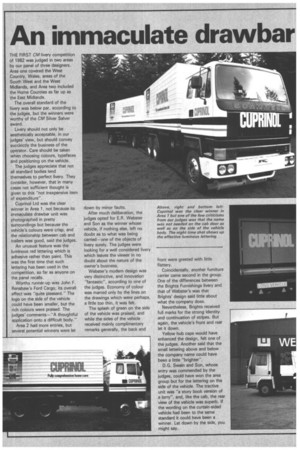
Cuprinol Ltd was the clear winner in Area 1, not because its immaculate drawbar unit was photographed in pretty surroundings but because the , vehicle's colours were crisp, and the relationship between cab and trailers was good, said the judges.
An unusual feature was the luminous red lettering which is adhesive rather than paint. This was the first time that such lettering has been used in the competition, so far as anyone on the panel recalls.
Worthy runner-up was John F. Renshaw's Ford Cargo; its overall effect was "quite pleasant." The logo on the side of the vehicle .could have been smaller, but the rich colours were praised. The judges' comments—"A thoughtful application onto a difficult body."
Area 2 had more entries, but several potential winners were let down by minor faults.
After much deliberation, the judges opted for E.R. Webster and Son as the winner whose vehicle, if nothing else, left no doubt as to what was being carried —.one of the objects of livery surely. The judges were looking for a well considered livery which leaves the viewer in no doubt about the nature of the owner's business.
Webster's modern design was very distinctive, and innovation "fantastic", according to one of the judges. Economy of colour was marred only by the lines on the drawings which were perhaps, a little too thin, it was felt.
The splash of green on the side of the vehicle was praised, and while the sides of the vehicle received mainly complimentary remarks generally, the back and front were greeted with little flattery.
Coincidentally, another furniture carrier came second in the group. One of the differences between the Brights Furnishings livery and that of Webster's was that Brights' design said little about what the company does.
Nevertheless. Brights received full marks for the strong identity and continuation of stripes. But again, the vehicle's front and rear let it down.
Yellow hub caps would have enhanced the design, felt one of the judges. Another said that the small lettering above and below the company name could have been a little "brighter".
D.G. Swain and Son, whose entry was commended by the judges, could have won the area group but for the lettering on the side of the vehicle. The tractive unit was "a story book version of a lorry", and, like the cab, the rear view of the vehicle was superb. If the wording on the curtain-sided vehicle had been to the same standard it could have been a winner, Let down by the side, you might say.