


CLASS THREE Over 17 tonnes GVW
Page 40
Page 41
If you've noticed an error in this article please click here to report it so we can fix it.
As usual this class attracted the largest number of entries, although the quality of those entries varied immensely. So when Wincanton Distribution Services' stunning Marmite tanker appeared on the screen you could almost hear a sigh of relief from the judging panel.
Rushton declared it "a gobstopper — it's a very different story". Green felt the design showed that the operator had "really considered what vehicle it was going on".
"There's no question of anything other than consistant approach here," was how Deery saw it. "It's a very good application."
While black may not be the best colour for a truck when it comes to road safety, the strident colours of the Marmite design ensured that you'd have to be looking the other way to miss it.
Land Rover Parts' artic, run by Federal Express Systemline, took second place. "It looks very efficient," said Rushton, "It conjures up the same image as the new Discovery; it clearly comes from the same stable."
It was interesting to note that while the judges liked the silver livery of the Land Rover artic their reaction to Exel's use of silver paint was muted.
In third place was the red and blue mixer from Tilcon. All agreed they'd done a good job with a difficult subject; the bold and striking colours were what Harris liked.
Five entrants in this class were commended. The unusually named Salads Etc was a favourite with Jones: "It's clean, its simple, its good."
Dennis Dixon's smart chrome-barrelled tanker was an excellent advertisement for the company, according to Rushton: 'It has a tremendous feeling of efficiency and cleanliness.
"I don't know whether its carrying food or petrol," he said, "but it gives me plenty of confidence. I'd be pleased to see that truck pull up outside my factory.'
• The smart dumpster entered by Cory Environmental Pollution Control was also appreciated, although the judges felt that more effective use could have been made of the bold colours and solid logo.
Brent Walker Breweries' Strongarm beer truck was another vehicle that was let down by detail. "The figure is crowding the lettering too much," said Green.
All the judges agreed, however, that its bold black and white design was particularly eye-catching.
Petroleum companies don't go in for radical designs: they tend to favour solid, competent corporate statements. The Gulf tanker fell into this category. "We're looking at a message that says you're dealing with a professional," was Weatherley's reaction.
CLASS FOUR
Passenger Carrying Vehicles Having already said that some operators still don't have a clue when it comes to liverying their trucks, this year's PCV entries were without doubt some of the most disappointing ever sent in.
Admittedly municipal operators tend to be conservative, but Rushton was convinced that many of the poor designs are a direct result of "the decision makers not going out on a limb".
This year's winner was a familiar face to the panel, and like Roberts Bakery it had taken a good design and made it even better.
Last year Western Scottish Omnibuses took the top slot in the PCV class and this year it did it again with a subtly modified version of the same theme.
Its luxury double-decker coach is a model of restraint, yet the choice of white and black and grey is never dull.
"They've toned it down a little," said Jones, "but it's still very classy." Again, Rushton was pleased that a previous winner hadn't "sat back on its haunches".
However the same design on a Western Scottish single-decker got the thumbs down. "It just doesn't work as well," was Deery's reaction.
We don't often get taxis in the competition, but Air Call's entry really took the judges by storm. Its clever use of colours and graphics, including the photo of the passenger riding in the back, took second place by virtue of being so different.
In third place we had another repeat performance, this time for London General Streetline, down one place from last year.
The only commendation was for the Surrey County Council's Guildford Link minibus, although its mention was more for the data it displayed than the design. "It's informative rather than motivational," was how Rushton saw it.
CLASS FIVE
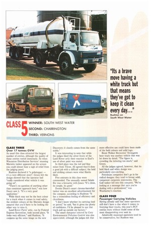
Best new corporate design Few operators would choose a blue and white livery for a vehicle spending a lot of its time on muddy farmyards and country lanes. But that's exactly what South West Water has done and its design was the universal choice for the top slot in new corporate design. There were some caveats, however, not least from Rushton: "It's a brave move having a white truck but that means they've got to keep it clean every day...it's not part of the corporate ethos."
Hale felt it was "very well executed; it definitely caught my eye".
In second place was the stylish tanker from Charringtons. "I like the little touch with the flame," was Green's reaction, "it's classy." Jones summed it up as "simple and unfussy".
For once it was Vernon's chance to be a winner. Its new corporate design, complete with "X-marks-the-spot" logo, was liked by all the judges.
The only operator to manage a commendation was Tayside Council, for its tanker, but indifferent typography let it down in the end.
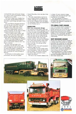
FTA SMALL FLEET AWARD The FTA's annual award is designed to bring out the best of the traditional liveries and this year is was the turn of Hargreaves Industrial Services. D&M Cargill of Perth and Hawcutt's Transport of Wolvey were commended. All three showed that "traditional" doesn't have to mean boring.
BEST DESIGNER AWARD Having more than one person working on a design sounds like a recipe for disaster (remember the camel?) but the entry from Wincanton Distribution Services proved the ultimate exception to the rule. The winning design was a real team effort between CPC's production management team at Burton on Trent and its marketing department at Esher in Surrey.
The result of the collaboration was the successful spreading of Marmite over a 32.5 tonne tractive unit.