


It's a truism that your trucks are mobile billboards for
Page 46
Page 47
Page 48
Page 49
Page 50
Page 51
If you've noticed an error in this article please click here to report it so we can fix it.
your business. But if a livery is to attract new business you'll need to do a bit more than simply painting your name and phone number on the side of the wagon. For examples of liveries that do the business, look no further than the winners of the 1998 Commercial Motor Livery Competition...
What do your vehicles say about you out on the road? T Do they pull in potential customers? To make a good impression, your trucks need to be clean and well maintained, of course, but there's more to it than that: sporting a well-designed livery that suits the vehicles and says something about your business and the pride you take in your operation goes a long, long way. The winners in this year's CM Livery Competition, sponsored by Sigma Coatings, show what can be done with eye-catching designs that are the result of a great deal of time and thought.
Each of our seven category winners was a worthy finalist, demonstrating a pride and attention to detail that simply shouts of professionalism.
Our congratulations to them all.
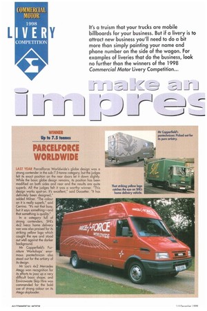
WINNER Up to 7.5 tones
PARCELFORCE WORLDWIDE
LAST YEAR Parcelforce Worldwide's globe design was a strong contender in the sub-7.5-tonne category, but the judges felt its exact position on the rear doors let it down slightly. While the basic globe design remains, its position has been modified on both sides and rear and the results are quite superb. All the judges felt it was a worthy winner. "This design works spot-on. It's excellent," said Dosseiter. "It has definitely been designed," added Milner. "The colour on it is really superb," said Cerrino. "It's not that busy, but it says something—and that something is quality." In a category full of strong contenders, SHUs 4x2 Iveco home delivery van was also praised for its striking yellow logo which caught the eye and stood out Well against the darker background.
Mr Copperfield's Furniture Workshops' enormous pantechnicon also stood out for the artistry of its design.
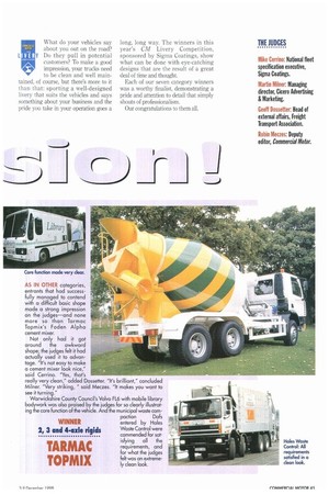
Mr Loo's 4x2 Mercedes Atego won recognition for its efforts to jazz up a very difficult basic shape; and Envirowaste Skip Hire was commended for the bold use of strong colour on its Atego skiploader. AS IN OTHER categories, entrants that had successfully managed to contend with a difficult basic shape made a strong impression on the judges—and none more so than Tarmac Topmix's Foden Alpha cement mixer.
Not only had it got around the awkward shape; the judges felt it had actually used it to advantage. "It's not easy to make a cement mixer look nice," said Cerrino. "Yes, that's really very clean," added Dossetter. "It's brilliant," concluded Milner. "Very striking, " said Meczes. "It makes you want to see it turning." Warwickshire County Council's Volvo FL6 with mobile library bodywork was also praised by the judges for so clearly illustrating the core function of the vehicle. And the municipal waste com paction Dafs
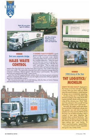
WINNER entered by Hales
Waste Control were commended for sat isfying all die requirements, and for what the judges felt was an extremely clean look.
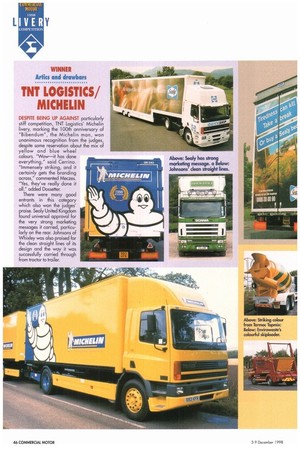
WINNER Artics and drawbars
TNT LOGISTICS/ MICHELIN
DESPITE BEING UP AGAINST particularly stiff competition, TNT Logistics' Michelin livery, marking the 100th anniversary of "Bibendum", the Michelin man, won unanimous recognition from the judges, despite some reservation about the mix of yellow and blue wheel colours. "Wow—it has done everything," said Cerrino. "Immensely striking, and it certainly gets the branding across," commented Meczes. "Yes, they've really done it all," added Dosseiter.
There were many good entrants in this category which also won the judges' praise. Sealy United Kingdom found universal approval for the very strong marketing messages it carried, particularly an the rear. Johnsons of Whixley was also praised for the clean straight lines of its design and the way it was successfully carried through from tractor to trailer.
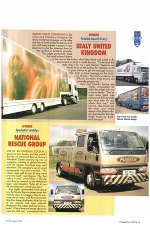
WINNER Product•based livery
SEALY UNITED KINGDOM
ALREADY HIGHLY COMMENDED in the Artics and Drawbars Category, the strong marketing messages on the sides and rear of Sealy United Kingdom's 2+2 artic will leave nobody it passes in any doubt as to what the company does, or the comfort its products provide. The judges particularly liked the road-related theme on the rear of the trailer, which they found well suited to the environment in which it would be seen. "It's the back that really does it for me," said Meczes. "Motorists are bound to be on the lookout for roadsigns so it's a good device to get the message across," "Yes, that's a clever message on the back," said Milner. "The back is always so difficult, but that's what drivers are generally going to see." Town and Country Paving was highly commended for what the judges felt was a classic design. "They've used some good safe colours and the livery tells you what they do and where they are," said Cerrino. Also of note was the clean and simple design of the Elmlea vehicle, operated for Van den Bergh Foods by Borthwick Transport.
WINNER Specialist vehicles
NATIONAL RESCUE GROUP
USE OF AN UNUSUAL COLOUR is going to turn heads, and the metallic bronze on National Rescue Group's Mitsubishi Canter recovery rig was no exception, working in perfect harmony with the deeper chocolate tone used elsewhere. The company's use of varied typography was also praised. "The colour works well for me. It's very smart and very bold," said Meczes. "Yes, that colour is rare," said Milner. "I like the way they've covered up the Mitsubishi logo," said Dossetter. "After all, it's not the manufacturer's vehicle any more." Also highly commended in this group was the Tarmac Topmix cement mixer that stole the show in Category 2 for its stunning use of colour; and the Envirowaste Skip Hire Atego skiploader, felt to be one of the cleanest and most colourful skiploaders the judges had ever encountered. "A lot of time and money obviously went into that one," commented Milner. A HUNDRED YEARS IN BUSINESS is good going in anyone's book, and the centenary livery on the municipal waste vehicles entered by Hales Waste Control was felt to be a suitable celebration. "Hales has spent a lot of time and money on doing something for its centenary year. I like that attitude," said Milner. "They've made much more of an effort and gone to much more expense than they had to do—but they have done it anyway. They couldn't have done much more, really." "It's a genuinely corporate livery with a corporate message about the company's centenary," Meczes agreed. "I like the colour," said Dossetter. "Yes, and the point job even extends to the inside," noted Cerrino.
Apart from the TNT Logistics Michelin vehicle, which was clearly going to win 'praise wherever it appeared, the TNT UK artic was also highly commended, although slightly let down by its oversized fleet numbers.
SHL won praise once again for its bold lettering, while the Glens of Antrim Potatoes artic found favour for its clean and simple look.
WINNER Best new corporate design
HALES WASTE CONTROL
WINNER 1998 Livery of the Year
TNT LOGISTICS/ MICHELIN
DESPITE THE HIGH QUALITY displayed in the liveries of all the individual category winners, there was never really any doubt about the overall champion, simply because its design was so immediately appealing.
As soon as they saw it in the Artics and Drawbars Category, the judges felt the TNT Logistics Michelin vehicle would end up carrying off the ultimate prize. Why? "Well, you'd be pleased to find yourself driving behind this, wouldn't you?" said Cerrino.
Normally, the judges would mark down liveries that didn't immediately indicate who the operator was and what its business entailed, but in this case they felt the aim of the livery was all about branding—and it worked a treat given Bibendum the Michelin Man's universal familiarity. "The vehicle's use of colour is just stunning, and then there's the fact that there is just that logo—nothing else," said Cerrino. "It doesn't need anything else," agreed Milner.
Commercial Motor's hearty congratulations go to a very worthy winner.
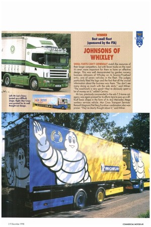
WINNER Best small fleet (sponsored by the FIA)
JOHNSONS OF WHIXLEY
SMALL FLEETS CAN'T GENERALLY match the resources of their larger competitors, but with Fewer trucks on the road it's even more important for them to have an effective design. This was well demonstrated by garden nursery business Johnsons of Whixley on its Scania/Fruehauf artic, one of seven vehicles in the fleet. The judges particularly liked the logo and the fact that all the crucial information about the business was there. "You don't see many doing so much with the side skirts," said Milner. "The coachwork is very good—they've obviously spent a lot of money on it," added Cerrino.
Mr Loo, previously commended in the sub-7.5-tonne category, was again praised for its efforts here to jazz up a difficult basic shape in the form of its 4x2 Mercedes Atego sanitary services vehicle. Mor Cross Transport Services' Renault Magnum/Kel-Berg Euroliner combination also won praise: They've clearly thought about it," said Milner.