


T HERE is more in the matter of the colour schemes
Page 48
Page 49
Page 50
If you've noticed an error in this article please click here to report it so we can fix it.
of passenger vehicles than some people will readily believe. I suppose that we can all think of towns where, for no reason of which we are immediately conscious, the buses seem better than those at home. Experts on decorative art will tell you that just as there are towns that stand high in the lists for appreciation of good music, so there are places that are among the select "
best-written" circles, where the signwriters' art is seen at its finest.
Leicester is probably the country's outstanding example, with Bradford among the best in the north. Both tradition and facilities enter into the building-tip of this reputation which, unknown to most of their citizens, some places possess.
How this matter of colour and the decorative art influences the mind can hardly be judged from the many hues of, say, a commercialvehicle show. There the layman's eye will be dazzled by the variety of colour and is not likely to receive a lasting impression until it alights upon such contrasts as may sometimes be found on two floors of an office building.
One, perhaps, is decorated with no thought other than to preserve the fabric and lettered solely with the object of conveying information to those who seek it. The other, by the proper application of the modern decorator's art, is lighter, brighter, more arresting to the eye and more inspiring. I can think of an example where such treatment has knocked half a century off the apparent age of the structure.
Whilst the same principles exist in relation to vehicles, there are aspects in which their application must necessarily be different_ When trams were established, the proprietors and coachpainters of the day usually did an excellent job, so much so that in many towns the liveries devised then have remained unchanged to the present time. By Ashley Ta In days when it has been found profitable for machine tools to be transformed from greasy-grey to eau-de-nil, endeavours have been made in some quarters to force the opposite trend on to commercial vehicles. For strict economy, I am assured, the best finish for buses would be a smoky grey, preferably with a broken surface— that is to say stippled—on which neither dirt nor minor damage would be easily detected. Fortunately for most of our towns, the need for economy has not yet plumbed such depths.
Taking at random a cross-section of the undertakings with which I am acquainted, it may be worthwhile to see what colours they are using and why. In this connection I cannot resist passing on a favourite story of Mr. W. R. Goodier, Wallasey Transport Department's general manager. Apparently, in 1901 when the council was preparing to introduce trams, a discussion arose concerning the colours of the
vehicles. No cogent opinion had been advanced and one member of the committee, impatient at the length of the proceedings, ejaculated: "Oh! See Greene."
Major R. R. Greene was the newly appointed general manager of the transport department and it is said that this comment gave ideas to several of the other members present so that sea-green has been the principal colour ever since.
In fact, there is no evidence why the particular colours were used originally, but the sea-green and cream are especially blended to the Wallasey undertaking's individual requirements and are not what would normally appear on any shade card under the samc headings. The green does not show any tinge of blue so often associated with sea-green, and the cream is soft and mellow with a primrose tint.
Salty air in Wallasey 'calls for colours that do not whiten too easily and the programme of painting and varnishing keeps the fleet smart in appearance. Dignity is added by the use of black linings.
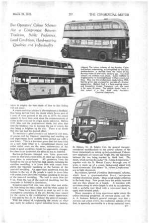
Of the two municipalities mentioned earlier in this article, Leicester City Transport has a traditional colour scheme that has been in operation since trams were introduced in 1904. The roofs and the main upper and !ower panels are finished in maroon, whilst upper and lower window framings are finished in cream.
The Bradford fleet colours of blue and ivory are continued because they are regarded as the smartest combination, although, as the undertaking has always used these two, it is also a matter of tradition. Care has been
ylor, A.M.I.R.T.E.
taken to employ the best shade of blue so that fading will not occur.
A cream-and-blue scheme is also employed at Sheffield, blue being derived from the shield which forms part of a coat of arms granted to the city in 1875; the cream appears to have been used since the commencement of trams in the area and its origin seems unknown. Before 1935, blue was the predominant shade, but after that time the tendency was to increase the use of cream, the idea being to brighten up the city. There is no doubt that this has had the desired effect.
To maintain a good cream in an industrial city does, of course, call for frequent repainting and touching up and experiments have recently been carried out with a new livery. This is a duo-tone green that has been tried on a new body fitted to a reconditionedchassis and whilst initial costs are the same, maintenance of the finish in good condition should be appreciably cheaper. But there is no doubt that the effect is not so cheerful.
Burrow-in-Furness changed over from green-andcream to blue-and-cream some 20 years ago when trams
gave place to motorbuses. All paintwork from the bottom to the top of the lower deck panels, including the waistline moulding, is in azure blue with cream from above the waistline moulding to the bottom of the cant-rail moulding. All upper-deck paintwork from the bottom to the top of the panels is again in azure blue with cream from above the waistline moulding to the top of the cant-rail moulding. The roof is azure blue for 9 ins, from the top of the cant-rail moulding, but the remainder is finished in aluminium.
Kingston-upon-Hull also uses azure blue and white, the blue being the basic colour and the white added for effect. These have' been, found to stand up well to the atmospheric conditions of the city, but the main reason ' for the choice is the combination's smart appearance,.
was told by Mr: 9., H. PulfreY: the general manager. With the ,6 bjet of brightening the :streets' of what may fairly be called a typical industrial town, namely;
St. Helens, Mr. R. Edgley Cox, the general manager, considered modifications to the colour scheme of the buses immediately on taking up his appointment. Colours now employed are cream and bright red, the separation between the two being marked by black lines. The motif, which carries the name "St. Helens Corporation," together with the St. Helens County Borough coat of arms, is made up of a cream background edged with fluted aluminium. -The letters" St. Helens Corporation" are in light chromium.
By tradition, Ipswich Transport Department's vehicles, which have a green-and-white livery, incorporate mottled aluminium panels. These need regular attention in the body shop. New panels have the polish removed and are then placed on a bench. A template with serrations along its entire length is used by an operative, with a portable tool fitted with a wire-wool head, to apply each nriottled patch.
Many managers of long experience agree about the colour-retaining properties of maroon paint, and Mr. A. A. Jackson, Bolton's general manager, says that a maroon and cream livery, the traditional scheme of his fleet, is especially serviceable in a damp industrial town, in addition to which it is in complete contrast with the schemes of the many other operators running into the borough.
In the main, the colours employed by the Burnley, CoInc and Nelson Joint Transport Committee are similar to those used by the Burnley Corporation Tramways Department half a century or more ago. Lower saloon panels are in crimson with all other panels in cream, except for two crimson bands around the upper saloon main panels and red which is employed for the roof between front and rear domes. All mouldings between the cream and crimson are painted orange,. wheels are in crimson and wings in black.
Crimson lake and cream is the choice of Oldham and the trams, which were abandoned just after the end af the war, always used these colours, although until 1930 the motorbus livery was cream and blue. Darwen has adopted red and cream with gold linings and, whilst the retention of this scheme is probably a matter of tradition, the effect has a certain freshness.
The red of Lancashire United Transport, Ltd., also goes back to tramway days. It was adopted some 50 years ago and has proved to be one of the best-wearing of colours. Mr. E. H. Edwardes, managing director, used to have light roofs on the buses but the doubledeckers are now completely red with ane cream band. Light grey roofs have been retained on the singleJeckers up to the present.
Maj. G. W. Ha yter, general manager of the Northern General Transport Co., Ltd., tells me that his group adopted red for the Northern, Tynemouth and Wakefield's undertakings because of its smart appearance and its retention of quality. The Gateshead company still employs for historical reasons the chocolate and cream which was the livery of the trams that have now been replaced.
To Be Different
The Highland Transport Co., Ltd., is using a deep crimson lake picked out in ivory and this has been the predominating scheme ever since the old Inverness and District undertaking commenced in 1925. Looking back to that time, Mr. W. H. Fowke tells me that there does not appear to be any special reason for the choice, except that other operators seemed to be employing brown, cream, blue and green.
The metallic silver and polychromatic blue of Northern Roadways, Ltd., is known to many people throughout the country and whilst these shades were picked for appearance, they also match the transatlantic aircraft with which connections are made on the service between Glasgow and Prestwick Airport.
The finish on the Accrington buses is distinctive and has a good weather resistance, Mr. H. Eaton, general manager, tells me. It includes blue main panels, orange waist band, red waist panel, black window frames, red louvres, black joint and louvre mould, black roof with red front and rear domes, a lighter blue for the inside rear platform and staircase, blue bonnet sides, red wheels and black wings. The finish is of high order and is certainly unlike those employed by any other operators in the area.
A new factor has entered into the question of colour a16 schemes of recent years. This is the economic necessity of accepting exterior advertisements. In consequence of this development, many " house " schemes have been completely broken up and the entire value of the original selection nullified. Because they have to put up other advertisements often employing " foreign' colouring, passenger operators are at a disadvantage compared with traders who use their own vans to carry advertisements and are able to relate the finish to any wording or illustration it is desired to present.
Individual Choice Enough has been said in the preceding paragraphs to show that, within broad limits, there is a large measure of agreement among operators about the manner in which they can best meet the needs for protecting the structure of their vehicles and maintaining prestige. That is not to say that those who have out-of-the-ordinary colour schemes are in any way working on the wrong lines, for the essential of colour is that it shall be an individual choice to fit particular circumstances. Obviously, when a " stable's " colours are being chosen, they must be easy to match and resistant to fading so that for a
reasonable period there is no noticeable difference in shade between the job that is fresh from the paint shop and that which has seen a length of service on the road. It is obviously advisable to seek the opinions of reliable paint suppliers when changes of colour scheme are under contemplation, so that information about matching qualities, fade resistance and application may be gained.
It should be particularly borne in mind that whilst certain finishes are of sufficient durability and gloss retention to need no varnishing, it is not every colour that can be brought up to the necessary standard without varnish. In the cases of various shades of maroon and blue, varnish must often be applied to give final protection. However, under tropical conditions varnishing is not to be recommended and liveries should be chosen which will avoid those colours which need this process.
In many undertakings, paintwork depreciates unnecessarily quickly because of over-enthusiasm in the cleaning bay. The outer skin of a newly painted vehicle is relatively easily damaged for some months. Many• managements might do well to ensure that new vehicles , are washed down with clean water and without the use of rough brushes or grit-impregnated rags. Goods vehicles are often sufferers from harsh treatment in this respect, and an examination of the washing bay will often reveal the source of otherwise inexplicable variations in durability and finish.
Not only is the use of colour a matter of good publicity, it can have its effect on staff relations. There is undoubtedly a feeling that the vehicle which outwardly appears right should be kept right. That which has a, neglected appearance, managers will tell you, is the more liable to mechanical neglect.