 1
1 2
2 3
3 4
4 5
5 6
6 7
7 8
8 9
9 10
10 11
11 12
12 13
13 14
14 15
15 16
16 17
17 18
18 19
19 20
20 21
21 22
22 23
23 24
24 25
25 26
26 27
27 28
28 29
29 30
30 31
31 32
32 33
33 34
34 35
35 36
36 37
37 38
38 39
39 40
40 41
41 42
42 43
43 44
44 45
45 46
46 47
47 48
48 49
49 50
50 51
51 52
52 53
53 54
54 55
55 56
56 57
57 58
58 59
59 60
60 61
61 62
62 63
63 64
64 65
65 66
66 67
67 68
68 69
69 70
70 71
71 72
72 73
73 74
74 75
75 76
76 77
77 78
78 79
79 80
80 81
81 82
82 83
83 84
84 85
85 86
86 87
87 88
88 89
89 90
90 91
91 92
92 93
93 94
94 95
95 96
96 97
97 98
98 99
99 100
100 101
101 102
102 103
103 104
104 105
105 106
106 107
107 108
108 109
109 110
110 111
111 112
112 113
113 114
114 115
115 116
116 117
117 118
118 119
119 120
120 121
121 122
122 123
123 124
124 125
125 126
126 127
127 128
128 129
129 130
130 131
131 132
132 133
133 134
134 135
135 136
136 137
137 138
138 139
139 140
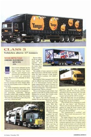
140 WINNER: BRITVIC TANGO comPENDED: DEANS FARM EGGS BRITVIC PEPSI AXIAL
Page 43
If you've noticed an error in this article please click here to report it so we can fix it.
Some liveries definitely last the test of time. And Deans Farm Eggs' Golden Lay livery (another past winner) was immediately shortlisted for its superb yet restrained design. However, it was ultimately let down at the back.
When it comes to tackling artics and drawbars it's amazing how many designs either cover the tractor/prime mover or trailer, but never both.
So Axial's imaginative approach to what must surely be one of the most difficult of vehicles to livery—an artic car transporter— was particularly noteworthy, although Dossetter couldn't help wondering whether the tractor logo was the "wrong" way around. "Why does the Axial name on the cab go the other way...it drives me mad!" Barrow reflected all the judge's views with his comment that: "The attempt on the trailer alone makes it worthy of a mention."
The inability of many operators to match their tractor livery with the trailer, especially where the latter featured a large graphic poster of food or produce, was clearly a major problem.
But Carlsberg Tetley managed to pull it off with its different beer brand trailers "keyed in" to its white-and-grey tractors. And the judges appreciated the touch of humour on the back of the Tetley Bitter trailer with its cricket-bat locking bar. "That would relieve a boring journey" Barrow reckoned.
The use of stunning, though isolated, vinyl graphics on the side of a trailer posed a major dilemma for our panel. Was it really a com• plete livery or just a mobile poster?
For Barrow the answer depended on whether the user had made any real effort to blend the "poster" with the rest of the truck. With Britvic's Pepsi artic he had no doubts that they had, and very effectively too.
"That's stunning graphics," he said. "You wouldn't miss that. I like the way they've matched the paint on the trailer and tractor to the black and blue in the graphics. The use of the Pepsi logo on the tractor is also consistent and the back is superb." Wilcockson agreed: "On a hot day you'd be salivating if you were behind that!" Gale felt Britvic had taken the whole vehicle into account "and not just the side for a poster."
But if the Pepsi artic was eye-catching it clearly had a rival in the stunning black-andorange Tango rig, also from Britvic.
"This answers all the complaints we made with the ones before," said Wilcockson. "There's more of a design element in this, as opposed to using the poster element with Pepsi. I think the Tango artic carries it off as it's a more all-round design."
"The communication is excellent," said Barrow. "They're both very panoramic," was Dckssetter's view.
The judges debated long and hard over which of the two Britvic entries should win. Here were two different designs, each with a consistent approach, from a company which clearly wants its trucks to be noticed. In the end it was the black-and-orange outfit that clinched it. As it says on the curtains, you know when you've been Tangoed!