Clear route to success
Page 106

Page 107

If you've noticed an error in this article please click here to report it so we can fix it.
Simplicity and clarity are vital if you're aiming to use a website to sell used trucks — we've taken another look at tle options.
The importance of getting the message across to potential and existing customers via the internet has never been so strong. Competition is rife and business-tobusiness websites are an increasingly popular route for direct selling. They enable potential buyers to see just what sellers are offering, and to contact them immediately.
It might sound obvious, but Chris Snook, who runs Zentopia Designs (www.zentopia.co.uk), a company that builds websites,says unless you are clear in what you can provide to a business they will look elsewhere for their solution.
Zentopia examined used truck websites 12 months ago to find the key to successful sales. "When we looked at used truck websites, what struck us was the element of doubt associated with selling," says Snook.
"You need utter trust in someone to buy a large vehicle from them, and that's not something you get from simply scanning a website full of secondhand trucks."
So, he adds, as a marketing tool a used truck website has to be clean, simple, straightforward and easy to approach.
We asked Snook to cast his eye over several websites picked at random and give us his verdict on them.
Chapman Commercials
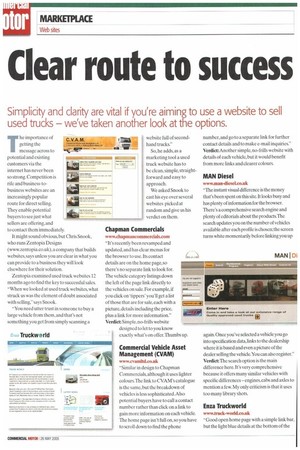
www.chapmancommerdals.com "It's recently been revamped and updated, and has clear menus for the browser to use. Its contact details are on the home page, so there's no separate link to look for. The vehicle category listings down the left of the page link directly to the vehicles on sale. For example, if you click on 'tippers' you'll get a list of those that are for sale, each with a picture, details including the price, plus a link for more information." Verdict: Simple, no-frills website designed to let to you know exactly what's on offer. Thumbs up. -111Trree, Commercial Vehicle Asset Management ((VAM)
www.cvamltd.co.uk "Similar in design to Chapman Commercials, although it uses lighter colours. The link to CVAM's catalogue is the same, but the breakdown of vehicles is less sophisticated.Also potential buyers have to call a contact number rather than click on a link to gain more information on each vehicle. The home page isn't full on, so you have to scroll down to find the phone number, and go to a separate link for further contact details and to make e-mail inquiries." Verdict: Another simple, no-frills website with details of each vehicle, but it would benefit from more links and clearer colours.
MAN Diesel
www.man-diesel.co.uk "The instant visual difference is the money that's been spent on this site. It looks busy and has plenty of information for the browser. There's a comprehensive search engine and plenty of editorials about the products.The search updates you on the number of vehicles available after each profile is chosen; the screen turns white momentarily before linking you up again. Once you've selected a vehicle you go into specification data, links to the dealership where it is based and even a picture of the dealer selling the vehicle.You can also register." Verdict The search option is the main difference here. It's very comprehensive because it offers many similar vehicles with specific differences — eng;ines,cabs and axles to mention a few. My only criticism is that it uses too many library shots.
Enza Truckworld
www.truck-world.co.uk "Good open home page with a simple link bar, but the light blue details at the bottom of the screen are hard to read on the white background.The browser simply clicks on the vehicles link to get to a list containing details of al.lthe vehicles on offer.The search can be narrowed by clicking on one of the vehicle categories on the left hand side.There's also a 'finance' button that links you to a direct-cost table — fill in the cost and you'll discover what you will have to pay each month."
'Verdict: The light blue type is the only negative thing we can see here.The site is simple and very effective, and the finance planner is a useful extra.
Conclusion
The format is the same on each website: home page,links to vehicles and services and contact details. From here on, it gets personal. Company colours can dictate choice, but Snook would recommend strong black/white ratios; either a strong background colour with light words or vice-versa.All four websites were clear and easy to navigate, but Snook felt that Chapman Commercials was the best because of its clear, bold layout. with Enza Truckworld a close second. •


