


The COLOUR Question
Page 28

Page 29
If you've noticed an error in this article please click here to report it so we can fix it.
Principles to Follow— And _What to Avoid— When Devising Livery and Lettering for .
Vehicles
By Alan Smith, F.R.S.A.
IN choosing an attractive livery for commercial vehicles, no colour need now be rejected because of doubts about its durability: Progress in paint technology has enabled manufacturers to offer wide ranges Of colour in different kinds of finish suitable for vehicles.
Moreover', much is now known of the scientific . principles applying to the matching of colour to avoid discordant effects: No operator need, therefore, make an aesthetically unwise choice, although the selection of a colour scheme may be limited by other considerations.
For instance, it would not be wise to paint a vehicle in colours similar to those used by another local operator, especially a competitor. Some organizations have standard colours for their packaging, and apply them also to their vehicles.
Occasionally the effect is not entirely happy when the design of a carton, intended to create shelf appeal, is scaled up for application to a large—and mobile —object such as a van.
Terms employed to describe the qualities of colour are "hue," " value " and " chroma," Expressions such as "-shade," " tone," " bright " or " soft " are not strictly scientific.
flue is the description used to differentiate between colours. Red is said to be a different hue from blue.
Value describes the difference between light and dark: a light colour has a high value and a dark colour a low value.
Chroma, an unfamiliar word to most laymen, indicates the strength of a colour. A pure vivid blue is of stronger chroma than a neutral or greyish blue.
Apart from lettering, most vehicles are painted in a single colour, and there is no reason why a two-colour scheme should necessarily be considered better. Small vehicles probably look best in single colours, but a stronger case for two colours applies to large vehicles on which the unrelieved use of one might appear unimaginative.
A good reason for having a two-colour su,heme is when it is decided to use one particularly striking hue. If an arresting appearance is required, a strong-chroma n26
red may be chosen, but when a large area has to be painted (as on a pantechnicon) the sole use of this colour would be overpowering.
The problem therefore arises as to how to choose the second component of a two-colour scheme. The easiest answer is to use a colour of the same hue but of different value—in non-technical Words, a darker or paler shade. Pleasing results. can be obtained in this way, but the solution is complicated by the fact that a vehicle's colour scheme can be altered by shadow effects. .
Sunlight raises the apparent value of a colour, whereas shadow reduces it. If, say, a van painted in Oxford and Cambridge blues were seen partly in sunlight and partly in shadow, a curious piebald effect would be conveyed.
Another selection is possible by reference to the colour circle (Fig. I). This is the arrangement of the colours of the spectrum in their natural order, each hue blending harmoniously with its neighbours.
When two colours are wanted for a scheme, they may be chosen either for a blend or a contrast. If a blend is required. the two colours should be neighbours or next-but-one neighbours on the circle; but if the need is for contrast (as for lettering), they should be diametrically opposite each other. Contrasting hues selected in this way are said to be complementary colours.
Eye Preconditioned
When the eyes see any hue, after observation there remains an impression of a colour known as the after-image. This is of the complementary colour to that seen, and it preconditions the eyes to the reception of the next colour to be observed.
The effect when two-colour combinations are used is that each hue is tinged by the complementary colour of the other. This is why green, for example, looks darker combined with yellow than with blue. When the combination is of complementary colours, each hue is intensified by the respective after-images and maximum contrast is achieved.
However, a clash of colours chosen according to these principles will occur if there is no variation in value. For instance, blue and orange are complementary colours, but if they were corn
bined in equal values the effect would be unpleasant. The rule is to refer to the circle to determine which is nearer the top—in this instance the orange—and to give this hue the higher value.
Thus a pale orange could be combined with a dark or medium blue. To do the reverse and use a dark or medium orange with a weak blue would result in a wishy-washy overall effect. The same rule applies when two hues adjacent on the colour circle are chosen; with orange and yellow, for example, the yellow should be of higher value.
Some difficulty oceurs if both the hues are the same distance from the top, as with red and blue-green or yellow and green-yellow, and, for this reason, such choices are never as satisfactory as others.
Notwithstanding the reasons which point to preferences for the use of hues which are either adjacent or opposite each other on the circle, certain combinations which ignore the rules, such as red and green, are noticeably popular. They may be made acceptable if a third hue is sparingly introduced.
So-called neutral colours—that is, white, various shades of grey and black are often used, but a hue may be selected again by reference to the circle. Any use of neutral colours may be regarded as taking the easy way out.
The two colours arc plotted on the perimeter of the circle and the third hue may be either of those midway between them on the two arcs. In the case of red and green, the third colour indicated in this manner may he either yellow or purple-blue. Thus, if the upper part of a van is painted red and the lower green, the clash of hues can be moderated by an intermediate band of yellow or purpleblue.
Value Variations
Again, there must be variations in value according to the positions of the colours on the circle. If red, green and yellow are chosen, red should be of the lowest value and yellow the highest; should purple-blue be the third colour, it should be of the lowest value and green the highest.
If an even more colourful scheme with four hues is wanted, both of the colours midway between the two major hues may be employed. More precisely, a three-colour scheme can be determined by inscribing an isosceles triangle within the circle and selecting the hues at each corner, and a four-colour scheme by inscribing a symmetrical quadrilateral.
Variations in aroma allow a wider flexibility'in the selection of colours than these rules seem to permit. Attention to comparative chromatic . strengths is essential to the devising of a tasteful scheme, especially for large vehicles and when complementary colours are employed. Colours of weak chroma are more restful than strong-chroma colours. For a single-colour scheme, a small vehicle might look well in a strong-chroma paint but, as already implied, a weaker chroma is better for a medium or large outfit. In any scheme of two or more colours, the principle concerning chromatic strength is that the colours nearer the top of the circle should be weaker, although this is probably less critical with blending than complementary hues.
Division of bodywork into areas of different colour allows almost infinite scope for individuality. It is better that the line where two colours meet should be along a moulding or similar contour of the bodywork than across a flat panel. Eye-catching colours are better high on the vehicle.
Because a vehicle is a moving object; complicated patterns. especially those with vertical stripes, should be avoided, as the different colours appear to run over one another. The effect of a scheme which might have looked fine on a piece of paper, or painted on a small model, is thus ruined.
Wide Letters
For the same reason, lettering should be in fairly wide characters, as they appear to be narrowed by the lateral movement of the vehicle. This is particularly the case on the near side, where the scan of the reading eye is contrary to the direction in which the vehicle is going.
As a moving vehicle is seen only briefly, the amount of lettering should be small. The nurnber of lines of signwriting should be few, and they should be level.
A common error is to have too much lettering in too many styleS. It is unadvisable to use more than one sort of lettering, but roman and italic characters in the same style may be combined. It is not necessary to outline or shadow lettering if the correct colour contrast is chosen, and the use of gold leaf is not so pressing as its popularity suggests.
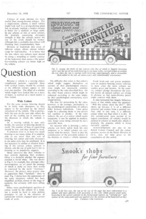
Many operators like their vehicles to bear artwork depicting their products. Often it is doubtful whether the expense entailed is worth while. The van shown in Fig. 2, for example, has, amongst other extravagances, an art panel the message of which is really no more than would be conveyed by the word "furniture." Moreover, the picture takes greater time to appreciate than " furniture " does to read. Fig. 3 shows how the appearance of the same imaginary vehicle has been simplified, perhaps almost to the stage of austerity, but certainly with more telling effect.
Other, more psychological, oualities of colour could be the subject of a book, but it would be hard to state definite principles to aid in the selection of colours for vehicles engaged upon certain kinds of work. The difficulty that arises is that colours which might suggest themselves on account of their psychological associations might not necessarily combine according to the rules described here. On the other hand, -colours which might be indicated according to the rules might, by their psychological associations, seem inappropriate.
The case for proceeding by the rules, however, is the stronger, particularly as the /psychological associations of colours differ between individuals. Lime green might be a pleasing shade to one person but repellent to another. If the rules indicate the use of,a colour which seems inapposite, it can be applied in moderation, larger areas being covered by more agreeable hues.
An operator who is devising a colour scheme can fairly safely back his own judgment as to which colours are consonant with his metier. There is also the consideration of the prevalent colours in the districts in which a vehicle operates. Fresh brick-reds and greens predominate on modern housing estates, whereas in most cities the main colours are sombre greys and browns. In the country, colours change throughout the year, but nearly all natural colours are strong in chroma, so that weak-chroma paints might contrast with them.
A time-honoured but largely fallacious factor is that which raises the question: "Will this colour show the dirt?" Dirt shows up because it is of a different Material and texture from a painted surface, and, in any case, is a different colour when wet than when it is dry. If this consideration were carried to its logical conclusion, all vehicles would be painted in colours to match dirt, which is precisely the practice which is being currently rejected.
Acknowiddgments are due to the British Colour Council and the colour advisory service of the Paints Division of IC.!., Ltd., for help' given in the compilation of this article.