


Does it really matter what your trucks look like out
Page 46
Page 47
Page 48
Page 49
Page 50
Page 51
If you've noticed an error in this article please click here to report it so we can fix it.
on the road? Do people really absorb messages that flash by in a matter of seconds? The answer must be yes—why else should advertisers spend millions on billboard advertising every year?
Look at the side of your truck. Does its livery have the same impact as a roadside poster? If not, you're missing a golden opportunity to send a message to potential customers throughout the country. A smart livery can, and does, win business as Peter Simpson of Newcastle based Simpson Bros recently told Commercial Motor.
Simpsons' biggest customer is Pet Plas Packaging of Leeds but it wasn't always that way until "a director of Pet Plas spotted one of our lorries on the motorway and approached us," says Simpson, Pet Plas now provides 23". of the firm's .,C6m turnover, Every year CM's Livery Competition celebrates the best of British design—and also drives home the message that it pays to have a good livery. And don't think it's only the big boys who win prizes, You don't need a big fleet, or big bucks—just big ideas. Out of the seven prize winners in this year's competition four run fewer than five trucks.
THE JUDGES
Martyn Pellevy: customer services director Railpart Phil Sampson: marketing and pr consultant, Albany Communications Fred Fieber: independent designer Red Crayola Brian Weatherley: Editor Commercial Motor
WINNER
Up to 7.5 tonnes
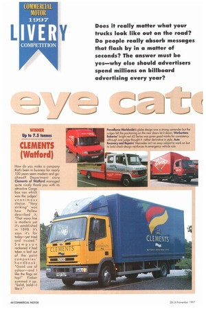
CLEMENTS (Watiord)
How do you make a company that's been in business for nearly 100 years seem modern and goahead? Department store Clements of Watford managed quite nicely thank you with its attractive Cargo box van which was the judges' unanimous choice. "Very striking" was
how Pellew described it, "That wavy line is modern yet it's established in 1898 It's says it's for today—yet tried and trusted." Sampson reckoned it had taken a leaf out of the paint companies' handbook: "Good use of colour—and I like the flags on top!" Fieber summed it up: "Solid, bold-1 like it." Parcelforce Worldwide's globe design was a strong contender but t judges felt the positioning on the rear doors let it down, Warburton: Bakeries' bright red 45 Series was given good marks for consistenc although one judge thought it rather derivative in style. Auto Recovery and Repairs' Mercedes isn't an easy subject to work on b its bold check design reinforces its emergency vehicle role,
WINNER
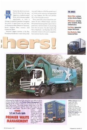
2,3 and 4-axle rigids
PREMIER WASTE MANAGEMENT
A front-end bin loader has to be about the most difficult vehicle to livery. But that didn't stop Premier Waste Management from trotting out the winner in class two. In particular its star logo drew high praise. "The drop shadow really picks it out, the colours are unusual too and the silver really makes the star stand out," noted Fieber. 'The star is like a medal," reckoned Pellew, while Sampson added: "It looks like it's just rolled off a space craft! Very striking, if you'd been looking through Yellow Pages you'd recognise it."
William Jackson's bread
wagon (top right)
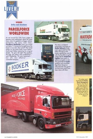
delivered a strong, traditional and wholesome feel to the judges—but does it need the full address? The big graphic signature on the Joseph Rice Logistics truck certainly caught the judge's attention—and praise. WINNER Arlin and drawbars
PARCELFORCE WORLDWIDE
It's not unusual for CM's livery judges to become more enthusiastic about the same livery when it's applied to a bigger vehicle. Sometimes the extra room helps. Parcelforce Worldwide's livery just missed out below 7.5 tonnes but brought home the bacon on an artIc. How come2 'The raised globe on the bock looks much better," confirmed PeHew removing his original doubts. 'It's got it all right—the graphics, the logo, the colour—very professional said Weatherley. "It's very restrained— but still very effective" concluded Sampson.
The clean uncluttered typography and logos on Booker Belmont's trailer were appreciated but the follow through on the tractor seemed less sure As with the Parcelforce rig the judges felt the Joseph Rice Logistics livery grew in stature as it grew in size. The panel felt the Fruitex graphics and snowflake logo (from Hargrave International) were good— but that more could have been done with them,
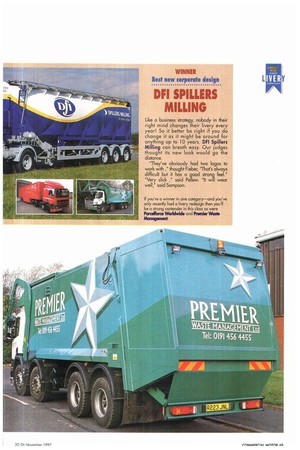
WINNER Specialist vehicles
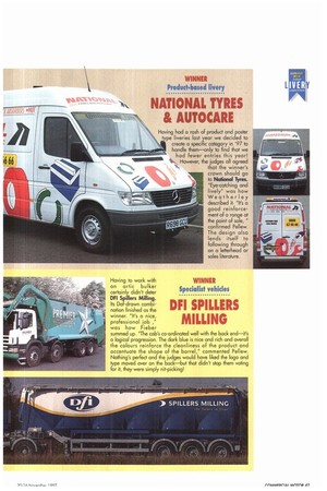
DFI SPILLERS MILLING
Having to work with
an artic bilker certainly didn't deter DFI Spillers Milling. Its Dal-drawn combination finished as the winner. "It's a nice, professional job was how Fieber
summed up. 'The cab's co-ordinated well with the back end—it's a logical progression. The dark blue is nice and rich and overall the colours reinforce the cleanliness of the product and accentuate the shape of the barrel," commented Pellew. Nothing's perfect and the judges would have liked the logo and type moved over on the back—but that didn't stop them voting for it, they were simply nit-picking!
WINNER Product.based livery
NATIONAL TYRES AUTOCARE
Having had a rash of product and poster t pe liveries last year we decided to create a specific category in '97 to handle therm—only to find that we
had fewer entries this year! 11.11111.11.1.1 111...„, However, the judges all agreed
that the winner's crown should go to Naliond Tyres. "Eye-catching and lively" was how Weatherley described it. "It's a good reinforcement of a range at the point of sale, " confirmed Pellew. The design also lends itself to following through on a letterhead or sales literature.
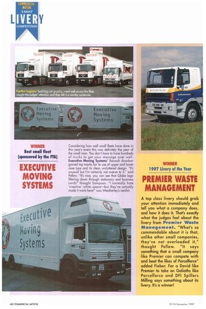
WINNER Best small fleet (sponsored by the FTA)
EXECUTIVE MOVING SYSTEMS
Considering how well small fleets have done in this year's event this was definitely the year of the small man. You don't have to have hundreds of trucks to get your message over well Executive Moving Systems' Renault drawbar gained top marks for its use of upper and lower case type and its clean uncluttered design. "It's unusual but I'm certainly not averse to it," said Pellew. "It's nice, you con see that Globe logo filtering down through stationary and business cards" thought Sampson. "I normally hate 'creative' white space—but they've actually made it work here!" was Weathertey's verdict.
WINNER 1997 Livery of the Year
PREMIER WASTE MANAGEMENT
A top class livery should grab your attention immediately and tell you what a company does, and how it does it. That's exactly what the judges feel about the livery from Premier Waste Management. "What's so commendable about it is that, unlike other small companies, they've not overloaded it," thought Pellew. "It says something that a small company like Premier can compete with and beat the likes of Parcelforce" added Fieber. For a David like Premier to take on Goliaths like Parcelforce and DFI Spillers Milling says something about its livery. It's a winner!
WINNER Best new corporate design
DFI SPILLERS MILLING
Like a business strategy, nobody in their right mind changes their livery every year! So it better be right if you do change it as it might be around for anything up to 10 years. DFI Spillers Milling can breath easy. Our judges thought its new look would go the distance.
"They've obviously had two logos to work with ," thought Fieber, 'That's always difficult but it has a good strong feet." "Very slick ," said Pellew. "It will wear well," said Sampson.
If you're a winner in one category—and you've only recently hacl a livery redesign then you'll be a strong contender in this class as were Pareeforce WorIckvide and Premier Waste
Management