


J magine being told that you've got to produce a TV
Page 32
Page 34
Page 35
Page 36
If you've noticed an error in this article please click here to report it so we can fix it.
commercial for your company, but you only have five seconds in which to get your message across. Sounds ridiculous? Well just consider how much time people get to see your truck livery on the road before it's passed by.
Getting the message over to prospective customers about who you are and what you do isn't easy, and a livery can either help or hinder. In this year's CM/ICI Autocolor Livery Competition we saw both kinds.
As usual the number of entrants was high and, like last year, the quality improved as the vehicles got bigger.
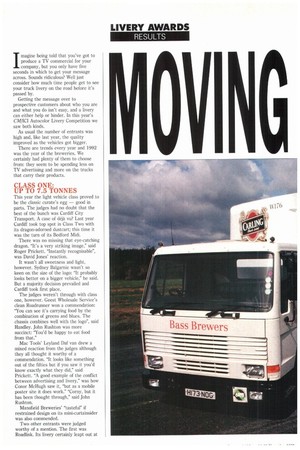
There are trends every year and 1992 was the year of the breweries. We certainly had plenty of them to choose from: they seem to be spending less on TV advertising and more on the trucks that carry their products.
CLASS ONE: UP TO 7.5 TONNES
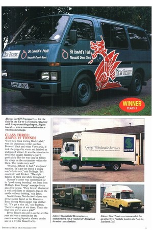
This year the light vehicle class proved to be the classic curate's egg — good in parts. The judges had no doubt that the best of the bunch was Cardiff City Transport. A case of déjà vu? Last year Cardiff took top spot in Class Two with its dragon-adorned dustcart; this time it was the turn of its Bedford Midi.
There was no missing that eye-catching dragon. "It's a very striking image," said Roger Prickett. "Instantly recognisable", was David Jones' reaction.
It wasn't all sweetness and light, however. Sydney Balgarnie wasn't so keen on the size of the logo: "It probably looks better on a bigger vehicle," he said. But a majority decision prevailed and Cardiff took first place.
The judges weren't through with class one, however. Geest Wholesale Service's clean Roadrunner won a commendation: "You can see it's carrying food by the combination of greens and blues. The chassis combines well with the logo", said Handley. John Rushton was more succinct: "You'd be happy to eat food from that."
Mac Tools' Leyland Daf van drew a mixed reaction from the judges although they all thought it worthy of a commendation. "It looks like something out of the fifties but if you saw it you'd know exactly what they did," said Prickett. "A good example of the conflict between advertising and livery," was how Conor McHugh saw it, "but as a mobile poster site it does work." "Corny, but it has been thought through," said John Rushton.
Mansfield Breweries' "tasteful" if restrained design on its mini-curtainsider was also commended.
Two other entrants were judged worthy of a mention. The first was Roadlink. Its livery certainly leapt out at you, but it seemed better suited to an express parcels carrier than a CV parts supplier. The second was Mid-Glamorgan Fire Service's mini artic, complete with flames on the side. "A nice idea, but badly executed" seemed to be the consensus.
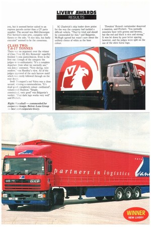
CLASS TWO. 7.6-17 TONNES
There was no argument over the winner of Class Two: DJ Alty Removals' superbly finished Scania pantechnicon. Even in the first run through of the category the judges were enthusiastic: "It's a complete departure from what we normally see," was Jones' comment. "Very daring, very modern," was Handley's view. All of the judges approved of the sack barrow motif which was nicely followed through on the rear doors.
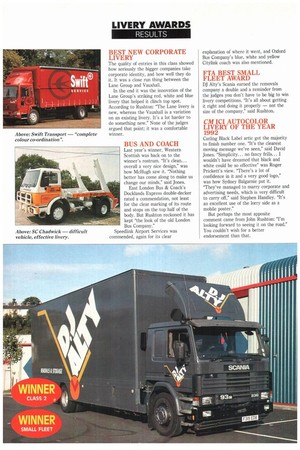
Swift Transport's red Volvo was a close second, winning a commendation. "It's dead good; completely colourcordinated", volunteered Rushton. "Simple, constrained, very good" was Balgarnie's verdict. "That dark logo works very well" said Prickett. SC Chadwick's skip loader drew praise for the way the company had tackled a difficult vehicle. "They've tried and should be commended for that," said Balgarnie. McHugh agreed but wasn't sure about the unlikely choice of white as the base colour. Thwaites' Renault curtainsider deserved a mention, said Prickett. 'You normally associate beer with greens and browns, but the red and black is nice and strong." It was let down by poor letter spacing, however, and the judges were split on the use of the shire horse logo.
CLASS THREE: ABOVE 17 TONNES
bet they drink Carling Black Label," was the unanimous verdict on Bass Brewers' black and white Volvo artic. It took the judges by storm and finished an undisputed winner. It was the attention to detail that caught Handley's eye: "I particularly like the way they've hidden the straps on the curtainsider within the black. That works very well."
"Original, difficult to fault," was Jones' reaction. "It's got the feel of a young man's drink to it," said McHugh. "It's excellent," said Prickett. The right balance of black and white throughout."
Burmah's tanker was commended for its "good strong branding", not least from McHugh. Ross Youngs' seascape livery also drew praise. "They haven't illustrated it with cod fillets or slapped a logo in the middle without thinking," said Jones.
Nestle Group Distribution's clever use of the tanker barrel as the Rowntree Extra Strong Mints packet was another hit. "It's got a nice tail," said Rushton, "there's a degree of wit there. That's the first time we've seen a joke!"
Bertie Basset also got in on the act this year and won a mention for the mouth-watering liquorice allsorts on the side of a Trebor Bassett artic.
BEST NEW CORPORATE LIVERY
The quality of entries in this class showed how seriously the bigger companies take corporate identity, and how well they do it. It was a close run thing between the Lane Group and Vauxhall.
In the end it was the innovation of the Lane Group's striking red, white and blue livery that helped it clinch top spot. According to Rushton: "The Lane livery is new, whereas the Vauxhall is a variation on an existing livery. It's a lot harder to do something new." None of the judges argued that point; it was a comfortable winner.
BUS AND COACH
Last year's winner, Western Scottish was back on to the winner's rostrum. "It's clean... overall a very nice design," was how McHugh saw it. "Nothing better has come along to make us change our minds," said Jones.
East London Bus & Coach's Docklands Express double-decker rated a commendation, not least for the clear marking of its route and stops on the top half of the body. But Rushton reckoned it has kept the look of the old London Bus Company."
Speedlink Airport Services was commended, again for its clear explanation of where it went, and Oxford Bus Company's blue, white and yellow Citylink coach was also mentioned.
FTA BEST SMALL FLEET AWARD
DJ Alty's Scania earned the removals company a double and a reminder from the judges you don't have to be big to win livery competitions. "It's all about getting it right and doing it properly — not the size of the company," said Rushton.
CM ICI AUTOCOLOR LIVERY OF THE YEAR 1992
Carling Black Label artic got the majority to finish number one. "It's the clearest moving message we've seen," said David Jones. "Simplicity... no fancy frills... I wouldn't have dreamed that black and white could be so effective" was Roger Prickett's view. "There's a lot of confidence in it and a very good logo," was how Sydney Balganiie put it. "They've managed to marry corporate and advertising needs, which is very difficult to carry off," said Stephen Handley. "It's an excellent use of the lorry side as a mobile poster."
But perhaps the most apposite comment came from John Rushton: "I'm looking forward to seeing it on the road.' You couldn't wish for a better endorsement than that.