 1
1 2
2 3
3 4
4 5
5 6
6 7
7 8
8 9
9 10
10 11
11 12
12 13
13 14
14 15
15 16
16 17
17 18
18 19
19 20
20 21
21 22
22 23
23 24
24 25
25 26
26 27
27 28
28 29
29 30
30 31
31 32
32 33
33 34
34 35
35 36
36 37
37 38
38 39
39 40
40 41
41 42
42 43
43 44
44 45
45 46
46 47
47 48
48 49
49 50
50 51
51 52
52 53
53 54
54 55
55 56
56 57
57 58
58 59
59 60
60 61
61 62
62 63
63 64
64 65
65 66
66 67
67 68
68 69
69 70
70 71
71 72
72 73
73 74
74 75
75 76
76 77
77 78
78 79
79 80
80 81
81 82
82 83
83 84
84 85
85 86
86 87
87 88
88 89
89 90
90 91
91 92
92 93
93 94
94 95
95 96
96 97
97 98
98 99
99 100
100 101
101 102
102 103
103 104
104 105
105 106
106 107
107 108
108 109
109 110
110 111
111 112
112 113
113 114
114 115
115 116
116 117
117 118
118 119
119 120
120 121
121 122
122 123
123 124
124 125
125 126
126 127
127 128
128 129
129 130
130 131
131 132
132 133
133 134
134 135
135 136
136 137
137 138
138 139
139 140
140 The blue and the white sets them alight!
Page 64
Page 65
Page 66
If you've noticed an error in this article please click here to report it so we can fix it.
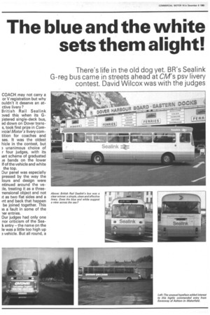
There's life in the old dog yet. BR's Sealink G-reg bus came in streets ahead at CM's psv livery contest. David Wilcox was with the judges
COACH may not carry a or V registration but why puldn't it deserve an atctive livery?
British Rail Sealink )ved this when its Glistered single-deck bus, ad down on Dover transs, took first prize in Com?rcial Motor's livery corntition for coaches and ses. It was the oldest hide in the contest, but 3 unanimous choice of r four judges, with its 'art scheme of graduated Je bands on the lower If of the vehicle and white the top.
Our panel was especially pressed by the way the lours and design were ntinued around the yele, treating it as a threenensional object and not >t as two flat sides and a int and back that happen be joined together. This ls a fault in some of the ler entries.
Our judges had only one nor criticism of the Seak entry — the name on the le was a little too high up a vehicle. But all round, a good design, giving life an older vehicle and worthy winner.
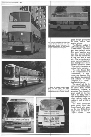
The Plaxton-bodied V( vo from Eavesway, Ashto in-Makerfield, Lancashi also won general acclai This again was in a grad ated blue scheme, but ti time with the darkest sha at the top and a yellc skirt. The white signwriti stood out well against t blue background and t typeface itself was strikir Once again, the design w praised for its harmony.
The only double-deck in the competition was al commended. It was brand-new Leyland Olyr pian, bodied by AlexandE and entered by Grew Glasgow PTE under Strathclyde banner.
The panel felt its liv€ was well-suited to its job an urban bus ; instarr identifiable, practical, al attractive. They thought tl green used on the lovki half of the body was pE haps a shade too light — ti bright yellow upper de making it look a little to heavy.
The most controvers entry came from Gre Green Travel who subm ted the new British Coac ways livery on one of Duple bodied Leylau opard. As a colour heme the judges liked it, t felt it owed more than ittle to the British Airways ery. "What a cheek!" id one of them indigntly.
But the judges also criti;ed some untidy and innsistent signwriting, parularly on the front panel iere the letter-spacing 3dually gets larger.
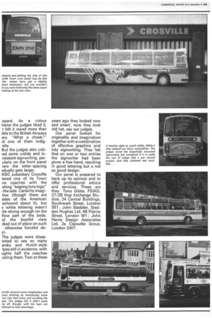
NBC subsidiary Crosville tered one of its Town nx coaches with the shing "leaping lynx logo" ithe side. Certainly imagi tive (though there are ades of the American eyhound about it), but e white lettering wasn't iite strong enough on the How part of the body. Id the bootlid view aked out of place on such otherwise forceful dem.
The judges were disapiinted to see so many arsky and Hutch-style .ipes still in evidence, with ughly half the coaches orting them. Two or three years ago they looked new and smart ; now they look old hat, say our judges.
Our panel looked for originality and imagination together with a combination of effective graphics and tidy signwriting. They felt that on one or two entries the signwriter had been given a free hand, resulting in good lettering but a not so good design.
Our panel is prepared to back up its opinion and to offer professional advice and services. These are they : Tony Gibbs, FSIAD, 27/28 Hop Exchange Studios, 24 Central Buildings, Southwark Street, London SE1 ; John Stadden, Stadden Hughes Ltd, 48 Fitzroy Street, London W1 ; John Harris Design Associates Ltd, 2a Clareville Grove, London SW7.