


S IMPLE, uncluttered design and attention to detail arc the qualities
Page 50
Page 51
Page 52
If you've noticed an error in this article please click here to report it so we can fix it.
shared by the winners of the 1985 Commercial Motor Livery Competition.
This year the competition was split into four classes: three for lorries and vans according to weight, and a fourth class for buses and coaches. A marathon session was needed to judge the 100 entries, with our judges studying slides of the front, back and sides of each vehicle.
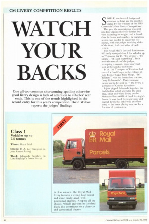
The Royal Mail's Leyland Roadrunner 810 easily scooped class 1 for vehicles up to 7.5 tonnes GVW. "It's strong". "It's simple". "It's got everything". Such were the remarks of the judges, prompting a second, more analytical look at the familiar red livery.
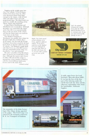
B. A. Lee Transport of Farnham had entered a Ford Cargo in the colours of John Farmer Super Shoe Shops. "It's different", was the immediate reaction, ‘`very Habitat-ish". That comment turned out to be spot on — the livery is a product of Conran Associates.
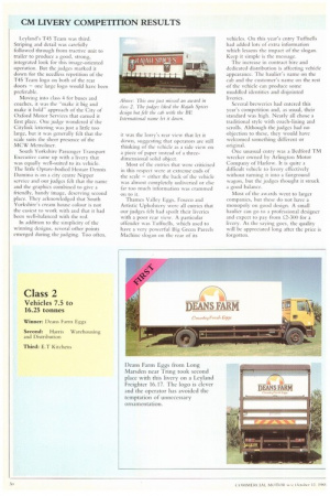
It just pipped Edmunds Supplies, the bodybuilder which executed the crisp blue, silver and white livery on the Mercedes-Benz 60813 of Lord Rayleigh's Farms. It was Lord Rayleigh's rear end that let down this otherwise excellent entry — the letter placing was out by a few crucial centimetres. Stepping up the weight range into class 2 for vehicles 7.5-16.25 tonnes, matters were not so clear cut. After some discussion Deans Farm Eggs emerged as the winner, with its fresh white and yellow livery and wellproportioned logo. The detail finish was good too, notably the matching of the wheels, chassis and sideguards.
It edged Harris Warehousing and Distribution into second place. Although the judges very much liked the I larris arrow they felt it was uncomfortably large on the rear doors of the vehicle, and that the Harris name was used too many times on the front.
Tim Muskett Transport of Warrington was another clear winner in the top-weight class (vehicles above 16.25 tonnes). He also took the Freight Transport Association award for the best livery from an operator with fewer than 15 vehicles. Tim Muskett's simple black and white livery on a Daf 28(X) tractive unit and curtainsided triaxle trailer was described as "neat and restrained". The sheer versatility of the Brewliners entry elevated it into second place in the class. Although the tractive unit's livery of white with red and blue stripes is uninspiring, it does manage to blend in with the several different trade-name liveries used in the trailer fleet. Leyland's T45 Team was third. Striping and detail was carefully followed through from tractive unit to trailer to produce a good, strong, integrated look for this image-oriented operation. But the judges marked it down for the needless repetition of the T45 Team logo on both of the rear doors — one large logo would have been preferable.
Moving into class 4 for buses and coaches, it was the "make it big and make it bold" approach of the City of Oxford Motor Services that earned it first place. One judge wondered if the Citylink lettering was just a little too large, but it was generally felt that the scale suits the sheer presence of the MCW Metroliner.
South Yorkshire Passenger Transport Executive came up with a livery that was equally well-suited to its vehicle. The little Optare-bodied Hestair Dennis Domino is on a city centre Nipper service and our judges felt that the name and the graphics combined to give a friendly, handy image, deserving second place. They acknowledged that South Yorkshire's cream house colour is not the easiest to work with and that it had been well-balanced with the red.
In addition to the simplicity of the winning designs, several other points emerged during the judging. Too often, it was the lorry's rear view that let it down, suggesting that operators are still thinking of the vehicle as a side view on a piece of paper instead of a threedimensional solid object.
Most of the entries that were criticised in this respect were at extreme ends of the scale — either the back of the vehicle was almost completely unliveried or else far too much information was crammed on Co it.
Thames Valley Eggs, Foseco and Artistic Upholstery were all entries that our judges felt had spoilt their liveries with a poor rear view. A particular offender was Tuffnells, which used to have a very powerful Big Green Parcels Machine slogan on the rear of its
vehicles. On this year's entry Tuffnells had added lots of extra information which lessens the impact of the slogan. Keep it simple is the message.
The increase in contract hire and dedicated distribution is affecting vehicle appearance. The haulier's name on the cab and the customer's name on the rest of the vehicle can produce some muddled identities and disjointed liveries.
Several breweries had entered this year's competition and, as usual, their standard was high. Nearly all chose a traditional style with coach-lining and scrolls. Although the judges had no objection to these, they would have welcomed something different or original.
One unusual entry was a Bedford TM wrecker owned by Arlington Motor Company of Harlow. it is quite a difficult vehicle to livery effectively without turning it into a fairground wagon, but the judges thought it struck a good balance.
Most of the awards went to larger companies, but these do not have a monopoly on good design. A small haulier can go to a professional designer and expect to pay from i.2-300 for a livery. As the saying goes, the quality will be appreciated long after the price is forgotten.